How to Mix Colours in Plein Air: A Practical Guide for Outdoor Oil Painters
A practical guide to how to mix colours in plein air: set up a limited palette, prioritise temperature, mix on the palette, and use clean, decisive strokes for better outdoor oil paintings.
Key takeaways
- • Prepare a consistent limited palette at home and place colours warm to cool so muscle memory speeds mixing in the field.
- • Always judge temperature before hue and use temperature relationships to create depth and light.
- • Mix fully on the palette with a knife, load the brush, and apply decisive strokes to avoid muddiness.
- • Start greens muted for British landscapes and build intensity rather than trying to knock down vivid tube greens.
- • Commit to a single light effect early, work lean with minimal medium, and clear your palette mid session when mixes drift.
Knowing how to mix colours in plein air is one of the skills that separates frustrating outdoor sessions from satisfying ones. You head out with a full palette and genuine enthusiasm, spend an hour squinting at the landscape, and come home with something that looks grey, overworked, and nothing like what you saw. Sound familiar? You're not doing it wrong because you lack talent. You're doing it wrong because outdoor colour mixing is a genuinely different discipline from studio work, and most instruction doesn't treat it that way.
This guide works through the whole problem: how to set up your palette before you leave the house, how to make clean mixes under pressure, how to handle the particular qualities of British light, and how to diagnose what's going wrong when the results aren't there. Follow it through once, take it out to the field, and your next session will feel noticeably different.
Why Colour Mixing Outdoors Is Different
In the studio you have controlled light, unlimited time, and the luxury of stepping back and looking. Outside, almost none of that applies. The light moves. Your palette sits at an angle that catches the glare. You're making decisions in minutes rather than hours. And the colours in front of you are nothing like the tubes on your palette.
These aren't small inconveniences. They fundamentally change how mixing needs to work. You need a system that is fast, disciplined, and robust enough to hold up when the clouds roll in and the light shifts entirely within the space of twenty minutes.
The Problem with Mixing What You Think You See
The biggest trap in outdoor colour mixing isn't technical, it's perceptual. Most of us paint symbols of colours rather than the colours that are actually in front of us. Grass is green. Sky is blue. Shadows are dark. These mental shortcuts are so deeply embedded that we reach for tube colours that match the category, not the light.
What you're actually trying to mix is what the light does to a surface, not what the surface "is". A sunlit field in October isn't green in any simple sense. It might be a warm ochre-yellow in the brightest passages, a muted grey-green in the mid-tones, and a cool blue-violet in the shadows. The moment you stop asking "what colour is that grass?" and start asking "what colour temperature is that passage, and how does it relate to the one next to it?", everything starts to make more sense.
How British Light Changes the Equation
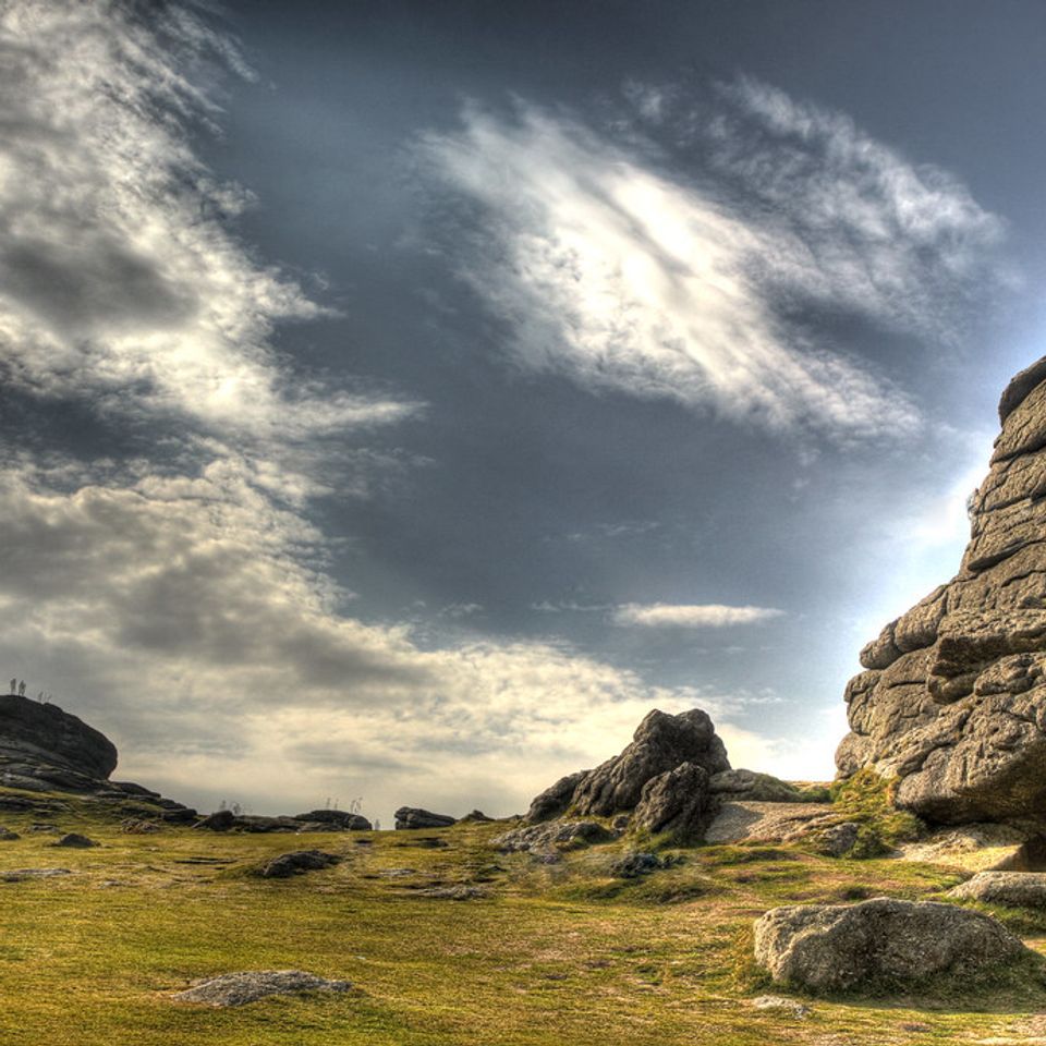
Most plein air instruction is written for conditions that don't apply here. American and Mediterranean tutorials assume bright, directional sunlight, hard-edged shadows, and a wide tonal range. British light is none of those things on most days.
Overcast skies compress the tonal range. Shadows become softer and less defined. The difference between your lightest light and your darkest dark is smaller than it would be in strong sun, which means you have less room to work with at either end of the value scale. Colour temperature shifts are subtler but still present: under a cool grey sky, shadows often carry a slightly warmer note than you'd expect, while lit passages can appear relatively cooler than in strong sun.
This is not a limitation. It's a characteristic. Overcast British light produces some of the most nuanced and beautiful painting conditions you'll find anywhere. But you do need to read it on its own terms, not borrow someone else's system designed for a different climate.
Setting Up Your Palette Before You Start
Discipline in outdoor painting begins before you arrive on location. The decisions you make at home about your palette will either give you speed and clarity in the field or cost you time and mental energy at exactly the moment you can least afford to waste it.
Choosing a Limited Palette
For plein air oil painting, fewer colours mean faster mixing, cleaner results, and better colour harmony across the painting. A palette of seven to nine colours is the standard. More than that and you're creating more problems than you're solving.
Here is a specific, practical limited palette that works well for UK conditions:
| Colour | Role | Notes |
|---|---|---|
| Titanium White | Mixing base | Essential for value adjustments |
| Yellow Ochre | Warm earth tone | Useful for sunlit passages and grounds |
| Cadmium Yellow (or hue) | Bright warm yellow | Mix greens, sunlight |
| Cadmium Red Light (or hue) | Warm red | Useful for warm shadows, flesh tones |
| Alizarin Crimson | Cool red | Cooler mixes, purples, shadow bias |
| Ultramarine Blue | Warm blue | Shadows, sky, deep darks |
| Cobalt Blue | Mid blue | Sky passages, softer blue mixes |
| Burnt Sienna | Warm earth | Darks, toning the surface, neutralising |
A word on black: leave it off the palette for now. It's not that experienced painters never use it, some do very effectively, but it has a flattening effect on mixes that is difficult to manage outdoors when you're working quickly. Burnt Sienna and Ultramarine Blue together give you a rich, controllable dark that behaves far better. You can bias it warm or cool depending on your mix ratio, which makes it far more useful than a single tube of black.
These colours are available from Jackson's Art and Ken Bromley, both of which carry professional-grade options across a range of price points.
Laying Out Your Palette Consistently
Where you place your colours matters almost as much as which colours you choose. Outdoors you're spending most of your time looking at the landscape, not the palette. If your colours are always in the same positions, muscle memory takes over. You stop hunting for the right colour and start using it.
A logical arrangement runs warm to cool across the top of the palette, with white either at the far left or in a dedicated corner away from the other colours. Keep your earth tones together. Keep your blues together. Use the centre and lower portion of the palette as your mixing area, and protect that space.
Consistency is the point. Whatever arrangement you settle on, use it every single time.
Prepare your palette at home
Squeeze out fresh paint before you leave the house, not when you arrive on location. Cold paint is stiffer, and faffing with tubes in the field wastes time and concentration. Keep a damp cloth or paper towels within reach for palette knife cleaning between mixes.
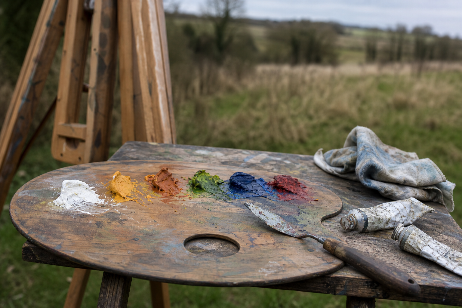
The Core Principles of Clean Colour Mixing
Getting colour mixing right outdoors comes down to a handful of principles applied consistently. None of them are complicated, but all of them require discipline, especially when the light is changing and the temptation is to keep adjusting.
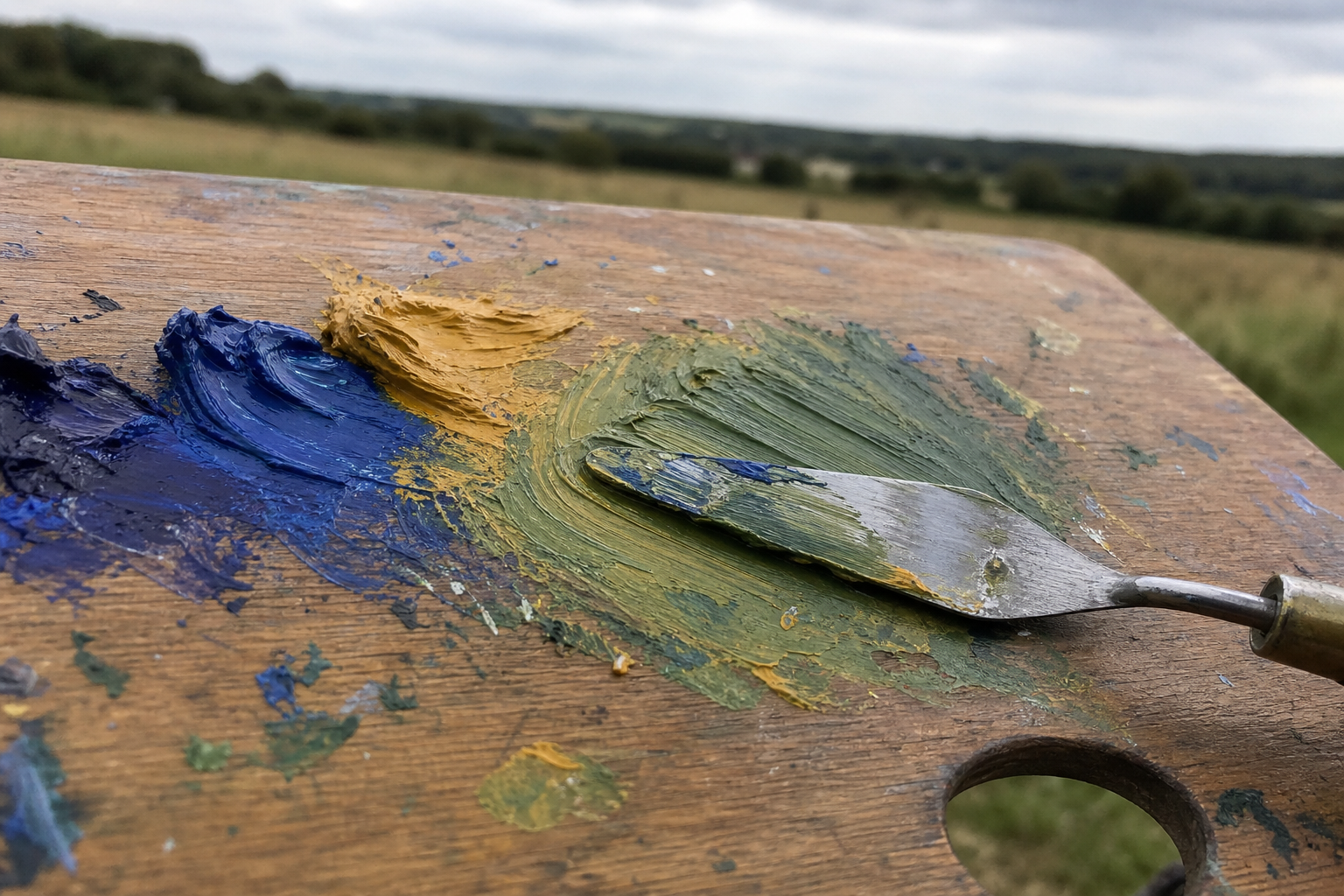
Mix on the Palette, Not on the Canvas
This is the single habit that causes the most muddy, overworked paintings among intermediate painters. The canvas is for applying colour. The palette is for mixing it.
When you put two or more colours on the canvas and then work them together with a brush, you're mixing under the worst possible conditions: on an absorbent surface, with a tool that picks up underlying wet paint, in an area where you can't see the true mix because it's surrounded by other colours. The result is almost always muddier than what you intended.
Mix completely on the palette. Load the brush. Apply the stroke. If it needs adjusting, do the adjustment on the palette first, then apply again. Going back into wet paint with a loaded brush to "fix" something is how one problem becomes three.
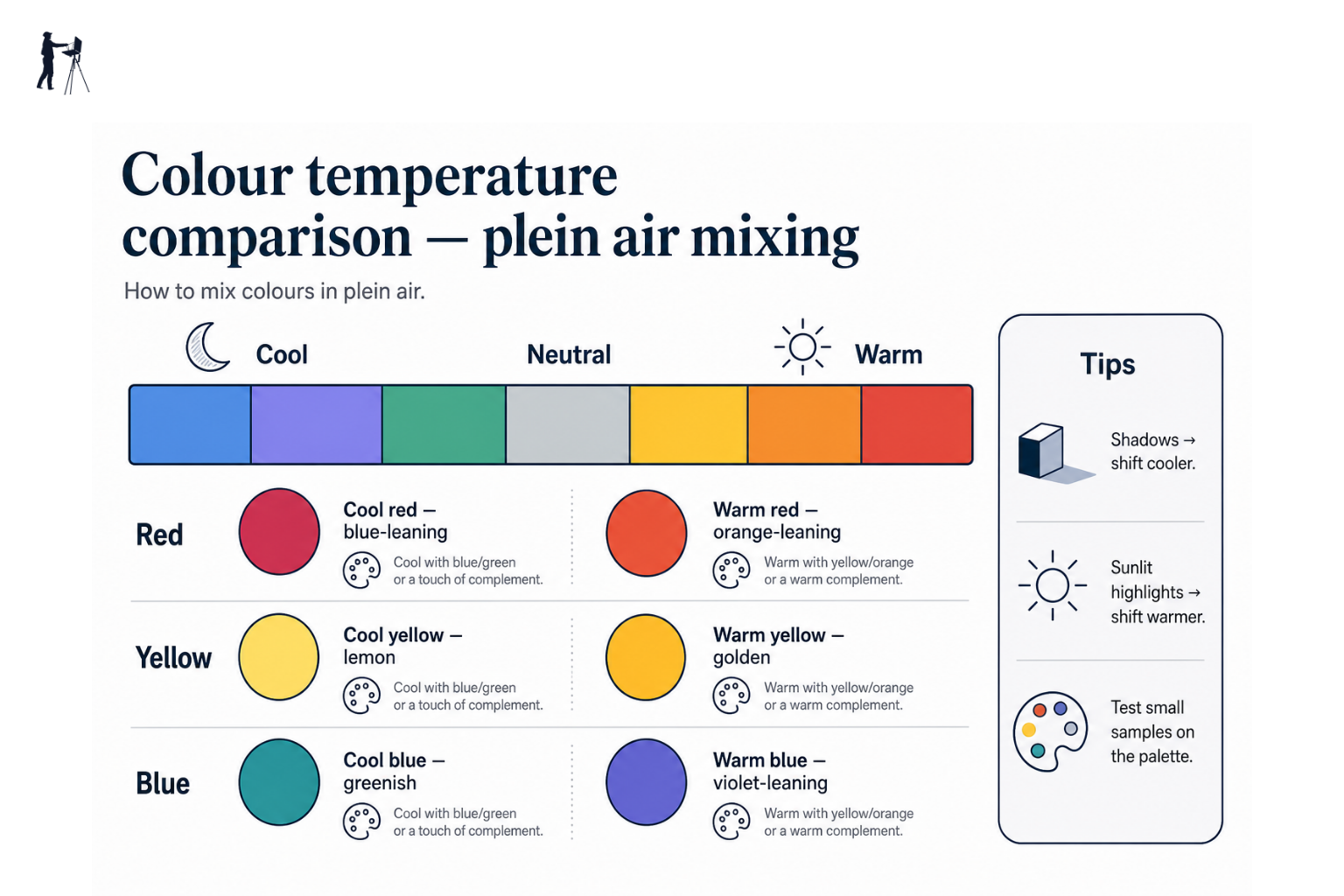
Temperature Before Hue
Before you make any other decision about a colour, ask whether the passage you're looking at is warmer or cooler than the passage next to it. This question should come before any decision about hue, value, or saturation.
Colour temperature is the underlying structure of how light behaves. In strong sunlight, the convention is warm light and cool shadows. Under British overcast conditions this is more nuanced: the light source is a cool grey sky, so lit surfaces often carry a slightly cool cast, while shadows can be surprisingly warm in comparison. It varies with the specific conditions, but the principle holds: your first question is always about temperature.
Get the temperature relationship right and everything else becomes easier to adjust. Get it wrong and no amount of hue correction will rescue the passage.
Neutralising Without Going Grey
Sometimes a colour needs to be knocked back in intensity without going grey or losing its life. The answer is partial mixing with a complementary colour, not the addition of white, and certainly not black.
Blue and orange are complements. Red and green are complements. Mixing them together in equal amounts produces a neutral. Mixing them in unequal amounts produces a neutralised version of whichever colour dominates. This is enormously useful for the kind of subtle, muted passages that appear constantly in British landscape painting.
Burnt Sienna and Ultramarine Blue deserve special mention. In roughly equal proportions they produce a powerful dark neutral that reads as neither warm nor cool until you bias the mix one way or the other. This combination can stand in for almost any dark passage in a landscape: shadow under a hedge, the dark of a tree trunk, a gate in deep shade. Explore the ratio and you'll find you use it constantly.
Mixing Greens in the British Landscape
Greens are the colour family that causes the most trouble for painters working in the UK, and the problem is almost always the same: starting from too saturated a position.
The green problem
Straight greens from the tube — especially Phthalo Green or Sap Green — almost never match what you see in a British landscape. They tend to read as too saturated and too uniform. Start with a muted mix and work upwards in intensity rather than trying to knock back a vivid tube green. Yellow Ochre and Ultramarine Blue is a surprisingly versatile starting point for most field greens.
For brighter passages, a mix of Cadmium Yellow and Cobalt Blue will give you a cleaner, more luminous green than the same mix with Ultramarine. For the muted, grey-greens that dominate most British landscapes, especially under overcast light, Yellow Ochre and Ultramarine with a little white is your workhorse mix. Add a touch of Burnt Sienna to push it further into the earth-green range.
The principle is to start muted and add intensity if the scene calls for it. It's much easier to punch a green up than to knock a vivid tube green down into something plausible.
Mixing Under Changing Light
The outdoor painter's constant challenge is that the subject is not static. Light moves, clouds shift, and the colour relationships that existed when you started your painting can look entirely different forty minutes later. How you manage this is as important as any mixing technique.
Committing to a Light Effect
The most important decision you make in a plein air session happens in the first five to ten minutes, before you've mixed a single colour. That decision is: what is the light doing right now, and what am I going to paint?
Once you've established the light effect you're working with, commit to it. Mix for that light. Do not chase the light as it changes. A painting made consistently for one light condition, even if that condition has passed by the time you finish, will be more coherent than one that has tried to follow every shift in the weather.
Many plein air painters work within a self-imposed one-hour window, particularly for strong or directional light. That's the time the effect holds. After that, you're either finishing the picture from what you've established or you stop.
Adjusting Mixes as the Session Progresses
Sometimes the light changes so substantially mid-session that you have a genuine choice to make: adapt the painting, or stop.
If the change is gradual, and you're working in overcast conditions (as is common in the UK), you often have a longer working window than you'd expect. Flat, diffuse light is more consistent than direct sun. Use that to your advantage.
If the light shifts dramatically, for instance a break in heavy cloud that introduces strong sun where there was none, the colour relationships in your painting may no longer hold. In that situation, stopping is not a failure. It's the right call.
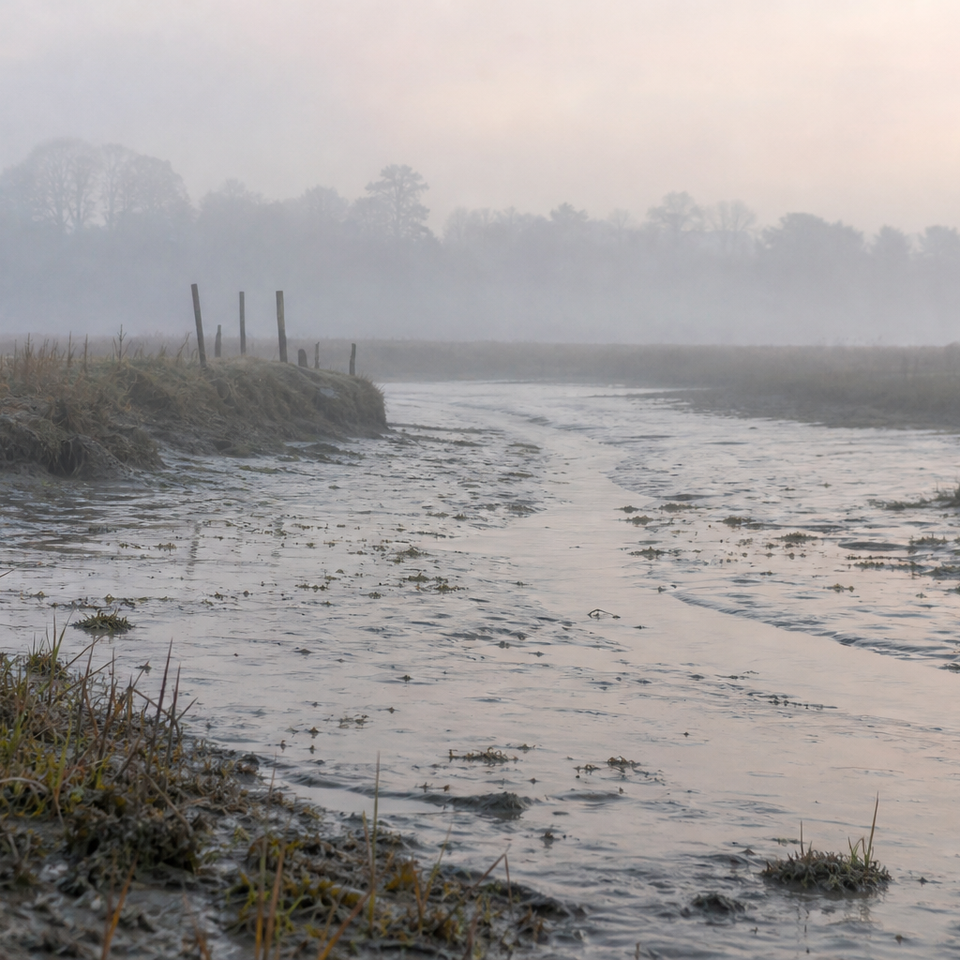
Working in Overcast Conditions
Overcast painting is an opportunity. Even light means no harsh shadows to chase, a longer and more forgiving working window, and the kind of subtle, atmospheric colour that is genuinely difficult to achieve in strong sun.
The main technical adjustment is at the extremes of the value range. With compressed tonal contrast, pure white is almost never the right answer for your lightest passages. A very slightly tinted, high-value mix will read as a light far more convincingly than straight Titanium White, which can look chalky and disconnected. At the dark end, be prepared to mix darks that are genuinely dark, the temptation in low contrast conditions is to let everything drift towards the mid-tones.
Practical Mixing Techniques in the Field
Using a Palette Knife for Mixing
Mix with a palette knife, not a brush. The knife combines paint more thoroughly, keeps the two (or three) colours clearly separate until you choose to combine them, and picks up no residue from previous mixes the way a brush does. A clean palette knife produces a cleaner, more predictable mix every time.
Keep the knife clean between mixes with a wipe on a cloth or paper towel. It takes two seconds and it prevents contamination from one mix bleeding into the next. A basic painting knife is all you need; Jackson's Art and Ken Bromley both carry a good range at sensible prices without the need to spend a great deal.
How Much Paint to Mix
Mix more than you think you need. This is one of the most consistent practical errors in outdoor painting, and the frustration of running out of a perfectly matched colour mid-stroke is entirely avoidable.
When you've matched a colour you're pleased with, mix enough to cover the entire passage it's intended for, plus a margin. The extra paint that goes unused is a much smaller problem than the wasted time trying to remix a colour you had and lost.
When to Clean the Palette Mid-Session
Your palette will gradually accumulate mixed colours, dirty half-tones, and accidental contamination from brushes that weren't clean. The signs that this is affecting your work are: mixes that look right on the palette but wrong when applied; a general drift towards grey or brown across all your colours; a mixing area that has no clean space left.
When this happens, scrape back. Preserve your fresh pure colours around the edge and clear the mixing area. In a session of two to three hours, you may need to do this once or twice. Build it into your routine rather than fighting through a contaminated palette.
Mixing a colour cleanly in the field
Identify temperature first
Ask: is this passage warmer or cooler than the passage next to it? Start there before touching hue.
Select your base pigments
Choose no more than two or three colours from your palette. Resist pulling in extra colours to correct.
Mix on a clean area of the palette
Use the palette knife to combine thoroughly. Check the mix in isolation, not next to the tube colours.
Compare to the canvas, not to nature
Hold your palette knife mix near the part of the painting it's going into. Adjust from there.
Apply with a loaded brush in one pass
Load the brush fully and place the stroke decisively. Avoid going back into wet paint to "fix" it.
Common Colour Mixing Problems and How to Fix Them
My Mixes Keep Going Muddy
Mud has four main causes, and they compound each other. The first is overworking the canvas: too many brushstrokes into wet paint drags colours together. The second is a dirty brush: if you haven't cleaned between colours, you're already mixing before you start. The third is using too many pigments in a single mix: more than three colours and you're almost always heading towards a neutral. The fourth is a contaminated palette: if your mixing area is full of previous sessions' muddy accidents, every new mix picks them up.
Address all four and the mud problem largely solves itself.
My Painting Looks Flat and Grey
Flatness is nearly always a temperature problem. If every passage in the painting sits at roughly the same colour temperature, the painting will feel inert regardless of how well the individual colours are matched. Go back to the temperature-first principle: what should be warm, and what should be cool? Even small temperature differences between adjacent passages create a sense of light and depth.
Overuse of white is a related problem. White cools and chalks every colour it enters. Use it to control value, but use it sparingly, and consider whether a slightly warm or cool tint in your whites would better serve the passage.
My Greens (or Skies) Never Look Right
For greens, refer back to the section on British landscape greens above: start muted, build up from Yellow Ochre and Ultramarine, and resist the pull of tube greens.
For skies, the same principle of temperature-first applies. British skies are rarely a single blue. Look at the temperature variation: cooler at the zenith, often warmer near the horizon, with passages of grey, white, and violet in the cloud mass. Mix each passage as its own temperature relationship rather than trying to find one sky-blue that covers everything.
A Note on Mediums and How They Affect Your Mixes
Many experienced plein air oil painters use minimal medium outdoors, or none at all. The reasons are practical: mediums add weight to your kit, add complexity to the mixing process, and introduce variables you don't need when you're already dealing with enough.
Linseed oil is the traditional medium but has a well-known tendency to yellow over time, which matters more in lighter passages. It also slows drying, which can be useful in the studio but less so outdoors where you want paint to behave predictably.
For outdoor use, if you want a medium at all, odourless mineral spirits are the most practical option. Zest-It and Sansodor are both widely available from UK art suppliers, are low-odour enough for painting near other people or in public spaces, and thin paint without significantly altering its handling characteristics.
The general principle for plein air oil painting is to paint lean outdoors and save richer, medium-heavy approaches for studio work. Less medium means faster drying, lighter kit, and one fewer variable to manage in the field.
Outdoor colour mixing is a skill that develops through doing. The principles in this guide give you a framework, but the real learning happens on location, in specific light, with specific problems to solve. Take a disciplined approach to your palette setup, commit to the temperature-first principle, mix on the palette and apply to the canvas, and your colour mixing will improve faster than you might expect. The grey skies are not your enemy. They're your painting conditions, and they're worth learning to read.
FAQ
Frequently Asked Questions
What limited palette should I use for plein air oil painting?
Use a seven to nine colour limited palette: Titanium White, Yellow Ochre, Cadmium Yellow (or hue), Cadmium Red Light (or hue), Alizarin Crimson, Ultramarine Blue, Cobalt Blue, and Burnt Sienna. Leave black off for now.
How do I stop my mixes turning muddy?
Mix on the palette not on the canvas, clean your brush and palette knife between mixes, use no more than two or three pigments per mix, and clear a contaminated mixing area when needed.
How should I mix greens in British light?
Start muted. Try Yellow Ochre plus Ultramarine with a touch of white for most grey greens. For brighter greens use Cadmium Yellow with Cobalt Blue. Add a little Burnt Sienna to earth them down.
What do I do when the light changes while I paint?
Decide on the light effect in the first 5 to 10 minutes and commit to it. Work within a one hour window for directional light. If the light shifts dramatically, consider stopping and returning another day.
Should I use mediums when painting outdoors?
Keep it lean. Minimal or no medium is best. If you need one, use odourless mineral spirits. Avoid heavy linseed outdoors because it can yellow and slows drying.
Author

PleinAirPainting Editorial Team
PleinAirPainting.co.uk helps artists paint outdoors with confidence through UK-focused guides, equipment advice, resources and plein air inspiration.