Painting Reflections in Plein Air: Rivers, Harbours and Wet Roads
Practical rules for painting reflections plein air: vertical alignment, darker less saturated values, reading water types, and a fast on-site sequence for UK canals, harbours and wet streets.

Key takeaways
- • Reflections sit vertically below their source, are darker and less saturated, and often shorter than the object.
- • Read the water first: calm gives mirror shapes, moving water gives broken vertical marks, wet roads produce compressed bands.
- • Block in sky and water early, then place simplified reflection masses before adding ripple and highlights.
- • Use medium-specific handling: oils benefit from a neutral underpainting and wet-into-wet softening; watercolour needs a wet wash and restraint.
- • For UK subjects check tides, work fast in changing conditions, and neutralise reflected colours for accurate tones.
Standing by a canal or harbour, you can feel it straight away. The scene above the waterline makes sense. The boats, the buildings, the trees — you know how to approach those. Then you look down at the water and something shifts. The colours are different, the shapes are slippery, and the whole surface seems to move the moment you try to pin it down.
Painting reflections in plein air trips up a lot of painters, and it's not because they lack skill. It's usually because they're working without a clear set of principles. The geometry of reflections is actually quite logical, and the values follow predictable rules. Once you understand how a reflection behaves, the water stops feeling like a mystery and starts feeling like any other part of the scene.
This article walks through everything you need: why reflections work the way they do, how to read the water before you start, a practical on-site sequence, and specific guidance on the subjects you're most likely to encounter in the UK, from narrowboat canals to rain-wet pavements.
Why Reflections Confuse Painters (and How to Stop Them)
Most reflection problems come down to one of three errors: the reflected shape is in the wrong position, the value is too bright, or the surface has been overworked into a mess of busy marks. None of these are difficult to fix once you can name them. The following three principles address each one directly.
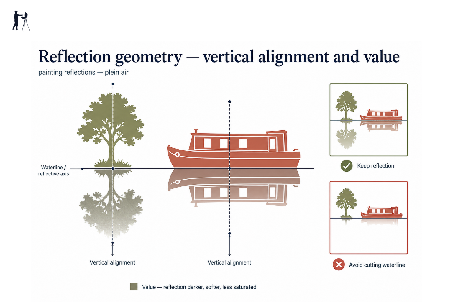
Position: reflections sit directly below their source
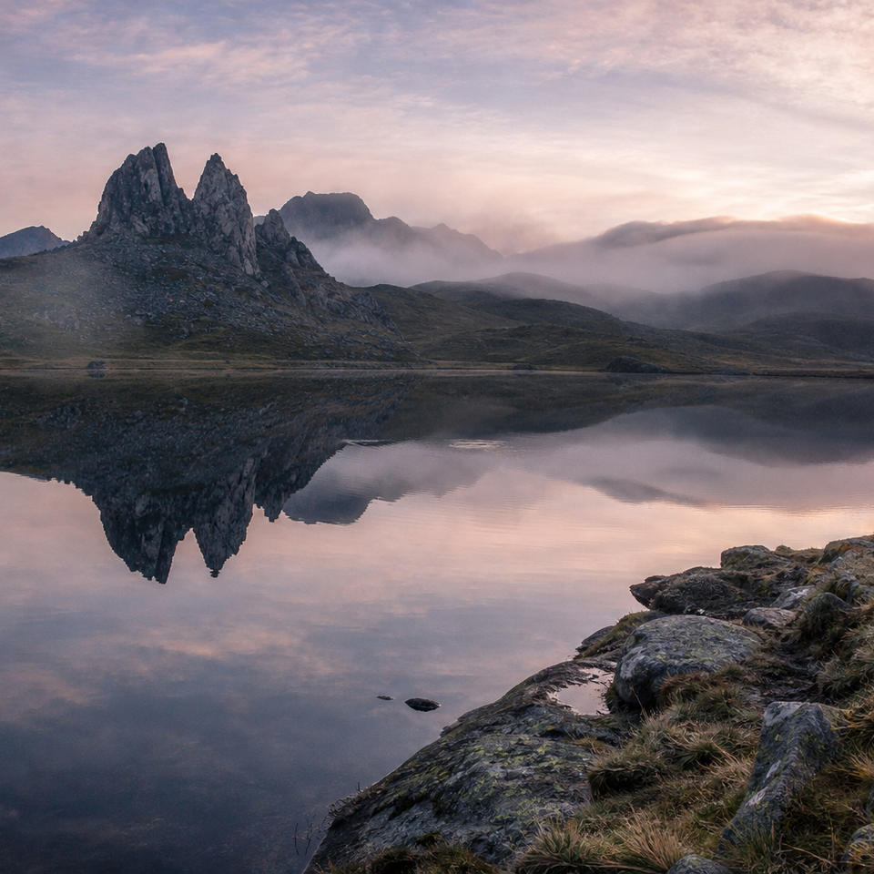
A reflection falls straight down from the object casting it. Not at an angle, not shifted left or right — directly below, in a vertical relationship with the source. Ripples can distort and widen a reflection sideways, but the core of it stays vertically aligned with the object above.
In practice, this means you can check your work with a simple test. If your reflected tree has drifted to one side of the actual tree, it's wrong. Measure vertically and adjust. This single correction fixes a large proportion of reflections that "feel off" without the painter being able to say why.
Value: reflections are darker and less saturated than the real thing
This is the most common beginner error, and it's worth being very clear about it. Reflected lights are darker than the lights they reflect. Reflected darks are lighter than the darks they reflect. And all reflected colour is more neutral, more grey, less vivid than the original.
The sky reflected in water is never as bright as the sky itself. If you've painted it at the same value or brighter, it will read as wrong every time. The one exception is specular highlights: those sharp bright flickers of light bouncing off the water surface itself. Those can be very bright. But they are not reflections in the technical sense. They sit on top of the water surface, not within it.
On overcast UK days, this actually simplifies things. A grey sky produces a grey-green or pewter-toned water surface with low contrast and muted colour. That is far easier to mix and hold together than the vivid Mediterranean blues beginners sometimes expect.
Shape: distant reflections are shorter than you expect
Objects close to the water's edge show a fairly complete reflection. As objects move further back from the bank, their reflections are progressively cropped from below. A narrowboat moored alongside the towpath shows a near-full reflection. A church tower 200 metres back from the riverbank might show only its upper portion in the water.
Overlap order is also preserved. If a tree stands in front of a building on land, the tree's reflection sits in front of the building's reflection in the water. This matters because it stops reflected shapes from floating free of the scene.
The reflection rule of thumb
If you can see the base of an object touching the water, you'll usually see a fairly complete reflection. The further the object sits back from the bank, the more its reflection is cropped from below. When in doubt, the reflection is always shorter, darker, and less saturated than the thing casting it.
Reading the Water Before You Paint It
Before your brush goes anywhere near the panel, spend a few minutes just looking. The type of water in front of you changes every decision that follows, and painters who skip this step often find themselves fighting the subject rather than working with it.
Calm water vs moving water
Still water, the kind you find on a sheltered canal or a harbour at low tide, gives near-mirror reflections with continuous, soft-edged shapes. Moving water, a river running over gravel or an estuary picking up wind, fragments those reflections into shorter, broken vertical shapes. Wet roads behave differently again: they reflect in a very compressed, foreshortened band that sits close to the observer.
Knowing which type of water you're facing tells you what kind of marks to make and how much detail to expect. Trying to paint a moving river as if it were a canal will produce confused results.
What colour is UK water, actually?
Challenge any assumption that water is blue. In the UK, it rarely is. Peat-coloured rivers run brown-green. Harbour water on an overcast day is typically grey-green or grey-brown. Canals can be anything from pewter to muddy ochre, depending on the bottom and the surrounding vegetation.
Water has no intrinsic colour of its own. It reflects what's above and around it. On a grey UK day with green trees on the bank, that usually means a muted, complex mix of cool grey and warm green, and quite a bit of brown from sediment. Mixing these tones accurately matters here, and neutralising your reflected colours with a touch of their complementary is often the quickest route. Working on your colour mixing outdoors will pay dividends across the whole water section of any painting.
Squint and simplify
Before you start painting, squint hard at the water until the detail blurs. You'll find three or four large tonal masses: usually a lighter zone where sky reflects, and one or more darker zones where the bank, trees, or buildings reflect. Surface ripples are noise at this stage; treat them as texture to add later, not as the primary information.
Establish those large masses first. Everything else, the ripple detail, the surface shimmer, the soft edges between shapes, follows from a sound foundation of simplified tone.
A Practical Sequence for Painting Reflections on Site
This is the core of it. The sequence below is designed to work within a typical UK session of 60 to 90 minutes, which means prioritising the structure early so that any interruptions (changing light, weather, passing boats) leave you with something coherent rather than a half-finished puzzle.
How to tackle reflections on site
Fix the horizon and waterline early
Before anything else, place your horizon line. Avoid centring it — a high horizon gives more water; a low one gives more sky. Mark the waterline where land meets reflection.
Block in sky and water as large masses
Lay in the sky colour, then immediately block in the water using the same colour, slightly darkened and neutralised. At this stage, water and sky should feel related, not independent.
Drop in the main reflection shapes
Add the large reflection masses — trees, buildings, boats — as simplified vertical shapes, slightly darker and less saturated than the objects themselves. Don't render; just place the approximate tone and colour.
Suggest surface movement
Once reflection shapes are in, use light horizontal strokes to indicate ripple or surface movement. Aim to break up the reflections slightly without destroying them. Less is more.
Add selective detail and highlights
Only at the end, and only if time allows, sharpen a few key edges, suggest ripple detail in the foreground, and add any bright surface highlights (sunlight on water, not reflections). Stop before overworking.
Oil and Watercolour: Medium-Specific Tips
The geometry and value principles above apply regardless of medium. What changes is the sequence and handling. Here's how each medium translates those principles into practical technique.
Oil painting: underpainting, wet-into-wet, and horizontal marks
Start with a thin, neutral underpainting, Burnt Sienna and Ultramarine work well together, to map the main tonal zones before colour goes on. This keeps the value structure honest even as the light shifts during the session, which in UK conditions can happen quickly.
Paint the water body first, then lay reflection shapes wet-into-wet with downward strokes, softening them horizontally while the paint is still damp. The softening of edges is what makes a reflection read as inside the water rather than pasted on the surface.
Use horizontal strokes for the water surface itself and more vertical marks for the underlying reflection masses. Fan brushes and soft flats are useful for suggesting shimmer without fussiness. Hard reflections on completely still water can go wet-on-dry with crisp edges, then be selectively softened afterwards.
Water reflections in oil painting benefit from restraint at the end of a session. It's always tempting to add one more pass of ripple detail. That pass is usually the one that destroys what you've built.
Watercolour: wet-into-wet and the value of restraint
Wet the water area of the paper before you start. Then drop in sky colour and broad water tones wet-into-wet, keeping them lighter in the distance and slightly darker in the foreground. The graduation happens naturally as the wash settles.
Add reflection colours as vertical washes while the paper is still damp. They'll soften at the edges without any help from you, which is precisely what you want. A clean, damp flat brush dragged horizontally across the area while still wet will suggest the water surface without obliterating the reflection beneath.
Then stop. Overworking watercolour reflections while they're drying is the single most common way to lose them. The paper needs to do its work. Once fully dry, a final light dry-brush stroke at the waterline separates land from water cleanly.
Watercolour timing
The wet-into-wet window for reflections is short, often under five minutes depending on paper, temperature and humidity. Mix your reflection colours before you wet the paper, so you're ready to drop them in immediately. Cold, damp UK weather actually helps here: the paper stays workable longer than in warm sunshine.
UK Subjects: Canals, Harbours, Rivers and Wet Streets
Canals and narrowboats
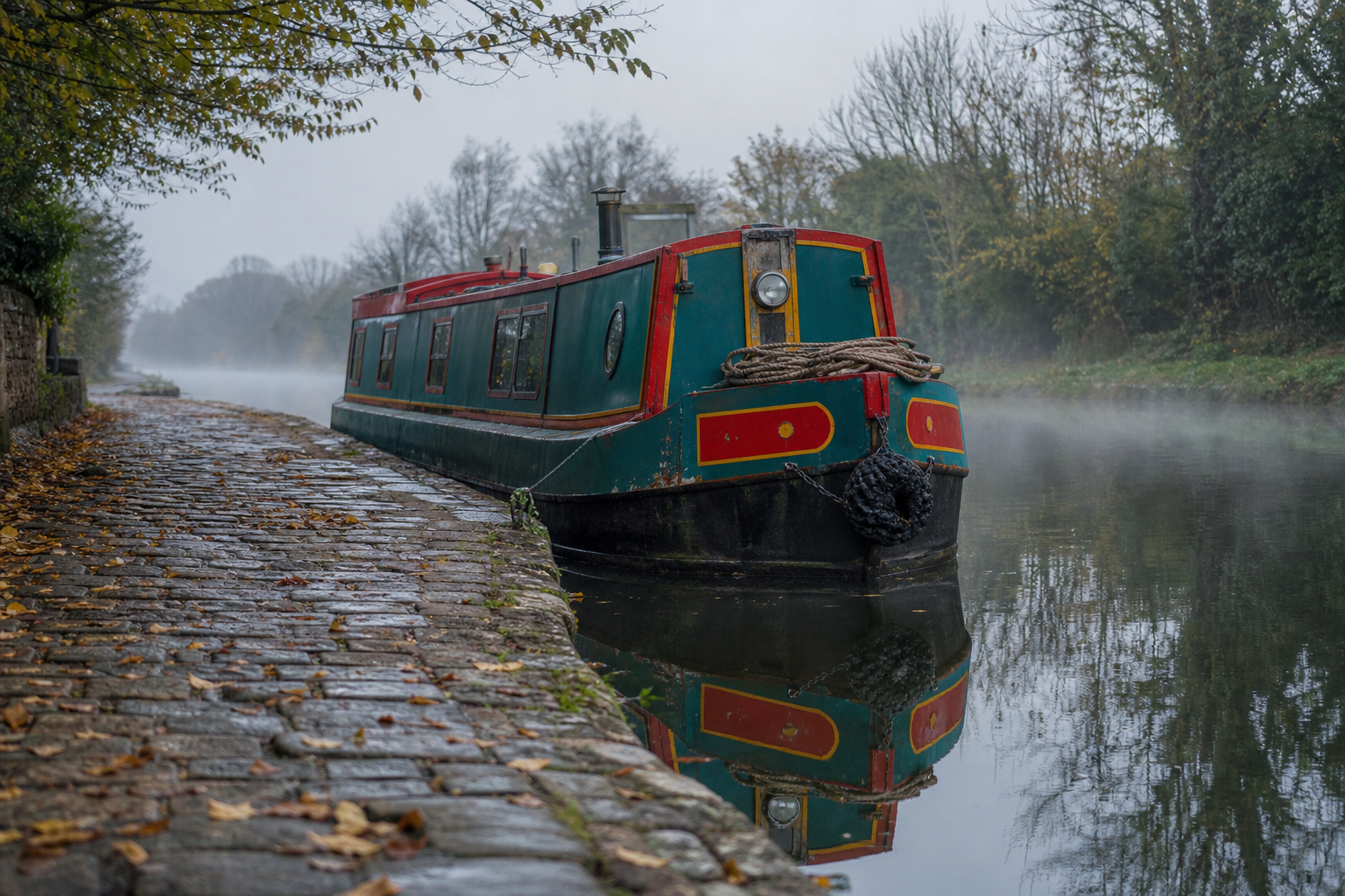
Canal water is often very still, especially in the early morning before boat traffic begins, and it tends to be quite dark. This makes it a near-perfect reflective surface and, for that reason, genuinely good practice. The geometry is easy to check and the reflections are clear and legible.
Narrowboats make excellent subjects because their geometric shapes produce equally geometric reflections. The bright painted livery of a narrowboat reflects back as a darker, neutralised version of those colours, and one of the most common errors here is painting the reflection at full saturation. If the boat is a vivid red, the reflection is a duller, deeper red, not a match. Towpath trees typically show only their upper halves in the reflection, the cropping rule in action on a subject that makes it easy to see.
Canal towpaths managed by the Canal & River Trust are generally open to the public, making them some of the most accessible plein air locations in England and Wales.
Tidal harbours and estuaries
A tidal harbour gives you a short window of calm, still water around low tide. That's your moment. Once the tide turns and any wind picks up, reflections fragment quickly and the conditions that made the water so appealing disappear. Check the tide table before you choose your spot, and be clear about whether your planned session falls in the calm window or outside it.
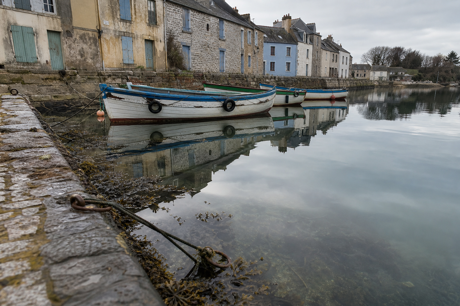
On an overcast day, harbour water is typically a complex mix of sky grey, boat shadow, and shallow bottom showing through in places. Read this as several large tonal masses rather than trying to account for every colour shift. Boats and masts make the most effective primary subject; their reflections anchor them to the water and give the composition its vertical structure.
Rivers: moving water
UK rivers move, and their reflections behave accordingly. Rather than a continuous mirror image, the reflection of a tree on a flowing river might be a series of short, broken vertical dabs in the right colour and approximate value. Don't fight this quality; use it. Energetic, broken marks suit moving water and can be painted quickly, which matters when conditions are changing.
The key is keeping the vertical orientation of your marks consistent even when the shapes are fragmented. Horizontal marks in the reflection area will read as surface movement; vertical marks read as reflected form. You need both, but in the right proportion.
Wet roads and pavements
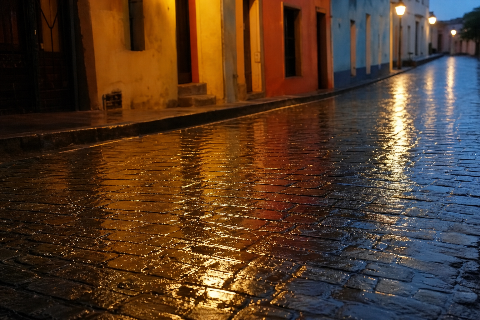
Wet roads after rain are one of the most rewarding and underused urban plein air subjects available to UK painters, which is to say, available most of the year. The reflections behave quite differently from water reflections: they're heavily compressed by perspective and appear in a narrow, foreshortened band just in front of each light source or coloured object.
The reflection of a red telephone box on wet tarmac is not a full red upright shape. It's a compressed sliver of red, sitting low and close to the base of the box, with sharp edges near the observer and softer edges further away. Keep these reflections shallow and dark. Their power comes from contrast and compression, not from detail.
| Subject | Water type | Reflection quality | Key challenge |
|---|---|---|---|
| Canal | Still, dark | Near-mirror | Keeping colours dark enough |
| Tidal harbour | Calm at low tide, then broken | Soft to fragmented | Working fast before tide turns |
| River | Moving | Broken, compressed | Suggesting movement without losing shape |
| Wet road | Shallow surface | Compressed, perspective-distorted | Getting the foreshortening right |
Common Mistakes and How to Fix Them
Reflections that look stuck on
Two things cause this: value that's too bright, and hard unbroken edges all the way around the reflected shape. Fix both at once. Darken the reflection overall, then selectively soften some of its edges with horizontal strokes that blend it into the surrounding water. A reflection that merges at its edges into the water around it reads as part of the scene. One with crisp edges all the way around reads as a cut-out.
Ripples that kill the reflection
Over-emphasised horizontal strokes are one of the most common ways to destroy a reflection. Once those horizontal marks dominate, the vertical structure of the reflected shapes beneath them disappears and the water reads as surface texture rather than depth. The fix: establish the full reflection first, then suggest ripple movement with lighter, thinner, broken horizontal marks, leaving enough of the vertical mass visible beneath. Less ripple detail generally reads as more convincing water.
Reflections in the wrong place
A reflected shape that doesn't sit directly below its source reads as wrong, even to a viewer who couldn't explain why. The vertical alignment rule needs to be checked deliberately, especially early in a session when you're placing the large masses. In composition terms, a misaligned reflection creates a floating shape that disconnects from the scene above it. Measure vertically from the object, correct early, and the problem doesn't compound as you add detail.
Practical Notes for Painting Near Water in the UK
A few sensible things worth keeping in mind when working near water outdoors.
Check bank stability before setting up, particularly after wet weather. River edges and tidal mud can be unpredictable, and a stable-looking bank may not be. If you're unsure, step back a metre.
If you're painting near working waterways, canals and working harbours in particular, be aware of boat traffic and keep your equipment back from the edge. A passing narrowboat creates more wash than you might expect.
For oil painters: keep solvents sealed when not in use and never dispose of waste near or in the water. Bring leak-proof containers and consider solvent-free mediums for any sessions near waterways. This is normal good practice, not an additional burden.
At coastal and estuarial sites, tides dictate your options entirely. Check the tide table before choosing your spot, know what state of tide gives you the conditions you want, and have an alternative plan if the timing doesn't work.
Reflections get easier the more time you spend observing them. The principles here, vertical alignment, darker and less saturated values, simplified masses read before the brush goes in, are all learnable. They don't require advanced skill. They require the habit of looking carefully before starting and the discipline to establish the structure before reaching for the detail.
Squint, simplify, and get the value right first. The water will follow.
FAQ
Frequently Asked Questions
How should reflections line up with their source?
Reflections sit directly below the object casting them. Measure vertically from the object to check alignment and correct any lateral drift before adding detail.
Why do my reflections look too bright or vivid?
Reflected lights are darker, reflected darks are lighter, and reflected colour is more neutral. Reduce brightness and saturation, except for specular highlights which sit on the water surface.
How do I handle reflections on moving water?
Simplify into short, broken vertical marks that keep the vertical orientation of reflected forms. Add light, broken horizontal strokes to suggest surface movement without obliterating the vertical masses.
What are the key differences between oil and watercolour when painting reflections?
In oil use a thin underpainting, paint water early, then lay reflections wet-into-wet with downward strokes and soften horizontally. In watercolour wet the area first, drop in vertical washes while damp, and avoid overworking as the paper does the blending.
Any practical UK tips for painting harbours, canals and wet streets?
Check tide tables for harbours, work in the calm window at low tide, expect dark neutral water on overcast days, and treat wet roads as compressed foreshortened bands of darker colour close to the observer.
Author

PleinAirPainting Editorial Team
PleinAirPainting.co.uk helps artists paint outdoors with confidence through UK-focused guides, equipment advice, resources and plein air inspiration.