Plein Air Value Studies: A Simple Field Method for Better Paintings
A five-minute, three-value field method for plein air value studies: squint, block in darks, add mid tones, then paint from the tonal plan.

Key takeaways
- • A value study is a quick monochrome thumbnail that maps light, mid and dark masses before painting outdoors.
- • Use the three-value system to force clear tonal decisions and avoid muddy, indecisive paintings.
- • Squint or convert a phone photo to greyscale to reveal true values, especially in green or flat light conditions.
- • Spend five minutes on two or three thumbnails, block in darks first, add mid tones, and keep the study visible while painting.
- • Minimal kit needed: small sketchbook, dark fineliner or marker, and a mid-grey wash or marker.
You set up your easel, the scene looks exactly right, and you start painting with real enthusiasm. An hour later, something has gone wrong. The painting feels muddy, the light has shifted, and what seemed so clear in front of you has become a confused mess on the board. It happens to almost everyone who paints outdoors, and it's genuinely demoralising.
The most common reason for it is straightforward: the value structure was never decided before the first brushstroke. Colour was chosen, detail was chased, and the fundamental pattern of light and dark was left to sort itself out. It rarely does. Plein air value studies solve this problem. A small tonal sketch made before you start painting gives you a clear decision about where the lights and darks go, and that decision holds the whole painting together even when the light shifts, the clouds come in, or the scene gets complicated. This article explains what a value study actually is, why it matters specifically outdoors, and gives you a step-by-step field method you can try at your next session.
What Is a Value Study (and Why Does It Matter Outdoors)?
A value study is a small, usually monochrome sketch that reduces a scene to a handful of tones. There's no colour involved, no detail, and no attempt to produce a finished image. The goal is to see the pattern of light and dark clearly so you can make a deliberate plan before committing to a full painting. Think of it as a map drawn before the journey rather than a record of it.
In a studio, you can take your time. You can return to the same setup tomorrow if you need to rethink the composition. Outdoors, that luxury doesn't exist. The light in Britain can shift from bright and raking to flat and grey in twenty minutes. A scene that looked dramatic when you arrived might look entirely different by the time you've mixed your first colour. The value study captures the essential pattern before it changes, giving you something concrete to work from even when the conditions move on.
Complex outdoor scenes compound the problem. A hedgerow full of different greens, a building with multiple shadow planes, water reflecting a partly cloudy sky: these all present an overwhelming amount of visual information. Without a tonal plan, it's easy to paint everything at equal weight and end up with a composition that has no clear focal point and no sense of light. The study forces you to simplify before that happens.
UK conditions make this particularly relevant. Overcast skies, which are the norm for much of the year, flatten tonal contrast and make it harder to see the value structure intuitively. British summer landscapes are notorious for their intensity of green, where every area reads as a variation of the same hue even when the tonal differences are significant. Low winter sun creates extreme value shifts that change rapidly as the sun moves. A few minutes spent on a thumbnail study before you start is genuinely useful in all of these conditions.
The core idea
A value study isn't a painting. It's a decision. You're deciding where the lights go and where the darks go before you commit to a full canvas. Don't judge it as a finished piece. Judge it as a plan.
Values, Tone, and the Squint Test
The difference between value and colour
Value is how light or dark something is, entirely separate from its hue. A deep red and a deep green can share the same value. A pale yellow and a pale blue can share the same value. When you convert a colour photograph to greyscale, every colour that looked distinct suddenly reveals whether it was actually contributing a different tone or just a different hue at the same tonal level.
This distinction matters enormously outdoors. Beginners often think in terms of colour when they should be thinking in terms of tone. When you're standing in front of a British summer landscape, you're looking at an enormous range of greens: yellow-greens in the sunlit grass, blue-greens in the distant trees, dark bottle-greens in the hedgerows. The colour differences are real. But the tonal differences within that green scene are equally real and far more important for the structure of your painting. Two areas that look different because of their colour might be contributing the same tonal mass, and treating them as the same value is often the right call compositionally.
How squinting helps you see value
Squinting is the single most useful free tool available to any outdoor painter. When you narrow your eyes significantly, colour information is suppressed and the main light and dark masses become visible as large shapes. Detail disappears, subtle hue variations disappear, and what remains is the basic tonal pattern.
Practise this before you touch your sketchbook. Squint at the scene until you can see just two or three large masses. Note where the lightest area is, where the darkest area is, and roughly where a middle tone sits. That's the information your value study needs.
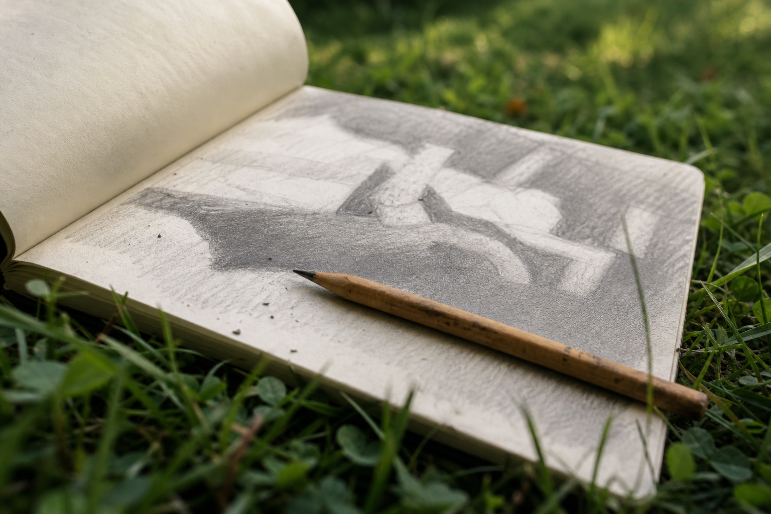
If squinting alone isn't enough, particularly on days when the scene is very complex or the light is very flat, try the phone photo method. Take a quick reference shot on your phone and convert it to greyscale. Most phones allow this directly in the photo editing tools. The resulting image shows you the tonal structure of the scene without the distraction of colour. On a grey overcast day in a British valley, where everything can look like a variation of the same cool mid-tone, the greyscale image will often reveal significant value differences that your colour-trained eye was suppressing.
The Three-Value System: A Practical Field Method
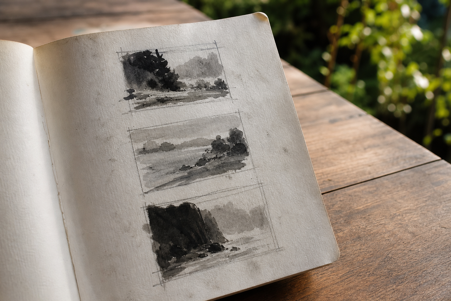
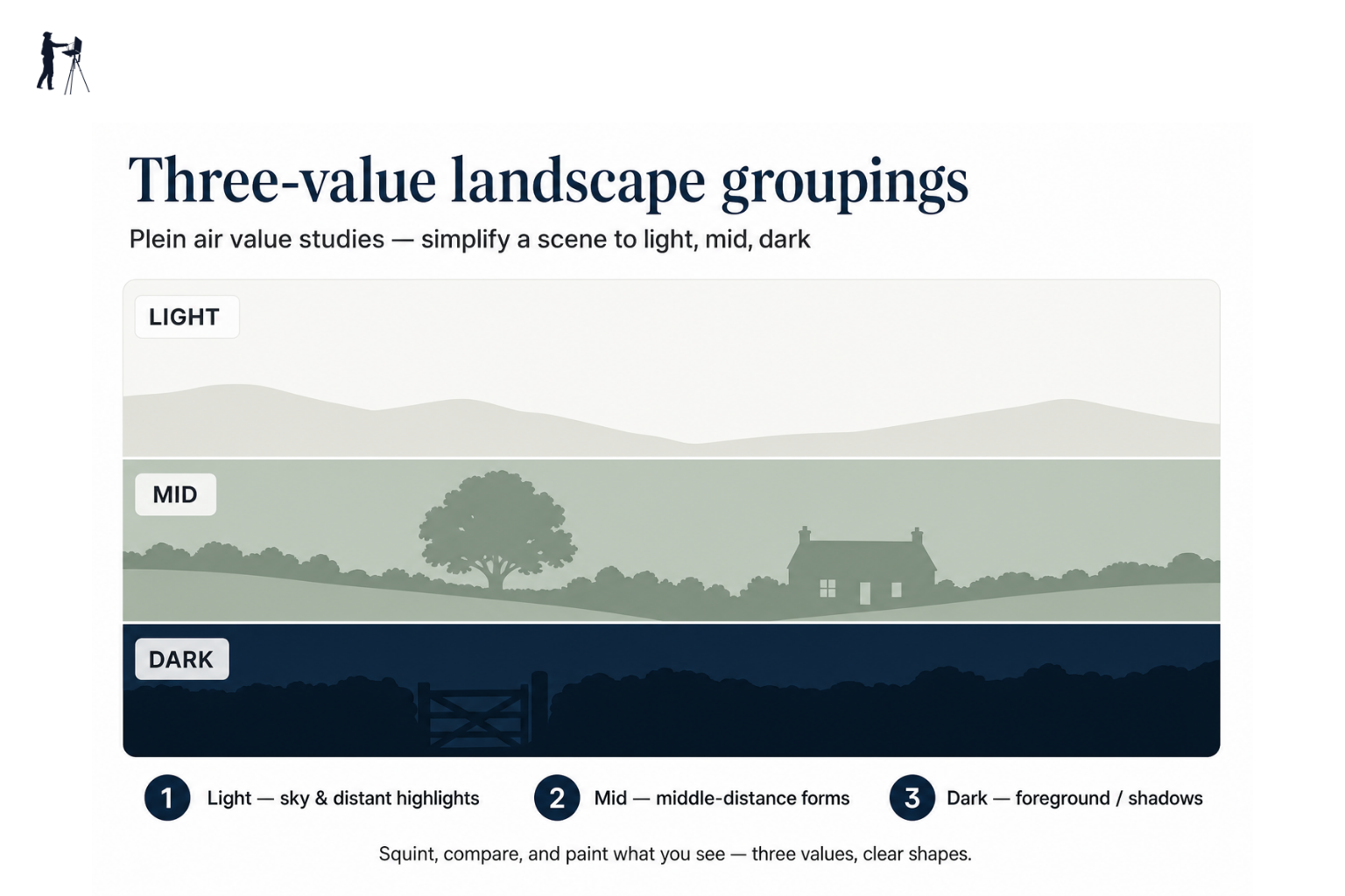
For most plein air planning, three values are all you need: light, mid, and dark. This is the recommended default, particularly if you're new to doing thumbnail value studies. It's simple enough to work quickly in the field and thorough enough to give your painting a genuine structural foundation.
Why three values and not more
Using too many tones is one of the most common mistakes in a planning study. Five or six values sound more precise, but in practice they create more decisions, more opportunities for confusion, and a final painting that looks tonally muddy and indecisive. The strength of the three-value approach is that it forces you to commit. Every shape in the scene has to go into one of three buckets. That decision-making pressure is the point: it's exactly the kind of simplification your painting needs.
If a composition works clearly in three values, the underlying design is sound. If it doesn't work in three values, adding more tones won't fix it. It will just obscure the problem.
A simple three-value painting exercise before you set up your easel takes five minutes and will save you from an hour of confusion in the actual painting.
| Value | What it represents | Typical outdoor examples |
|---|---|---|
| Light | Sky, sunlit surfaces, bright water | Pale sky, sunlit grass, white walls in sun |
| Mid | Transitional tones | Shadowed grass, distant trees, overcast sky close to horizon |
| Dark | Deep shadows, shaded masses | Shadows under hedgerows, dark tree masses, buildings in shade |
Notan: the two-value version
Notan is a Japanese term for the harmony of light and dark. In practice, the notan approach means reducing everything to two values only: pure black and pure white. There's no mid tone at all. The purpose is to check whether the composition reads as a clear, distinct pattern of light and dark shapes.
It's a useful first check. If the two-value version looks confused or ambiguous, the composition probably needs rethinking before you go further. Some painters do a quick notan sketch before moving to a three-value study. Others go straight to three values. It's not essential, but the term comes up regularly in plein air circles and it helps to know what it refers to.
How to Do a Plein Air Value Study: A Step-by-Step Field Method
Some painters worry that doing a thumbnail study before painting feels mechanical, or that it removes the spontaneity that makes outdoor painting worthwhile. It's a reasonable instinct, but it's worth turning around: the study is what enables the painting to be spontaneous. Once the fundamental light and dark decisions are made, you can paint with confidence and freedom rather than second-guessing every mark. The plan is what makes the spontaneity possible.
A simple field value study method
Squint at the scene
Before you touch paper, squint hard at the view. Identify the largest light mass and the largest dark mass. Ignore detail completely.
Sketch a thumbnail frame
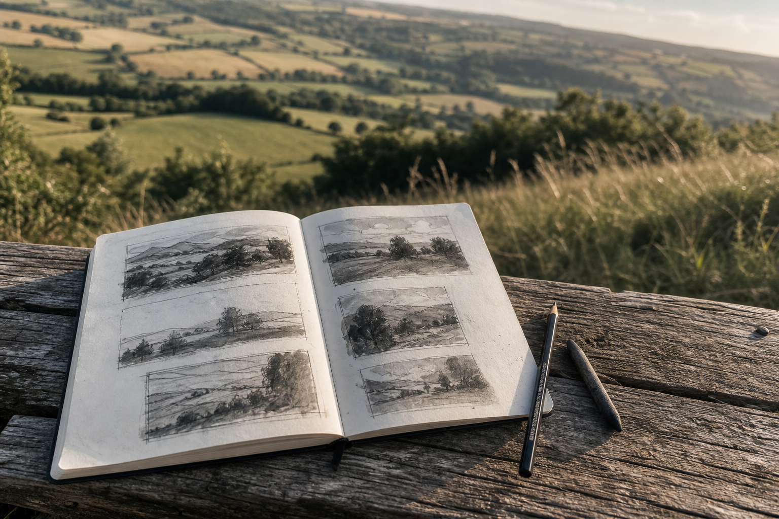
Draw a small rectangle on your sketchbook page, roughly the proportions of your intended painting. About 6x8 cm is ideal. Do several blank frames so you can try multiple versions.
Block in the darks first
Using a pen, dark marker, or diluted wash, fill in the dark masses as flat shapes. Don't draw outlines and fill them in. Think in terms of shapes, not objects.
Add the mid tones
Add your middle value, again as flat masses. Leave the paper (or a pale wash) as your lightest value.
Check the design
Hold the thumbnail at arm's length and squint at it. Does the pattern of lights and darks read clearly? Is there a clear focal point where the highest contrast sits?
Decide on proportions
Check you haven't split lights and darks 50/50. Aim for one dominant value family, roughly 60-70% of the composition, with the other values providing contrast.
Translate to your painting
Once you're satisfied with the thumbnail, use it as your tonal map. The colours and details can vary, but the light-dark structure should stay true to the study.
Before you commit to one thumbnail, do two or three variations. Try placing the dominant dark mass in a different position. Try a version where light dominates and another where dark does. The light is changing while you work, and a few minutes spent exploring alternatives at thumbnail stage is far more productive than realising halfway through a full painting that the composition isn't working. Getting this right at thumbnail stage takes minutes, not an hour.
Gear for Value Studies in the Field
You don't need specialist equipment for plein air value studies. The simplest possible kit is genuinely enough.
What you actually need:
- A small sketchbook, A6 or A5. Anything larger makes it harder to fill quickly with small thumbnails
- A dark pen, fineliner, or marker for the darks and outlines
- A mid-grey marker or diluted ink wash to indicate mid tones
- Alternatively, a compact watercolour set with a single neutral dark pigment: Payne's Grey or Lamp Black work well
Jackson's Art, Ken Bromley, and Cass Art all stock compact sketching kits that are well suited to this kind of work. You don't need anything specific to value studies; if you have a basic sketching kit, it will do the job.
The simplest possible kit
A 6B pencil, a black fineliner, and a small sketchbook are genuinely enough to do plein air value studies. You can add a grey marker or a pocket watercolour tin later. But don't let gear become a reason not to start.
Common Value Study Mistakes (and How to Fix Them)
Value study habits: what works and what doesn't
Pros
- + Starting with large masses and keeping shapes simple
- + Using three values and committing to them
- + Producing two or three thumbnail variations before choosing
- + Keeping the value structure when you move to full colour
Cons
- - Using five or more values and creating tonal mush
- - Spending time on detail instead of shapes
- - Splitting lights and darks 50/50 and producing a static composition
- - Abandoning the value plan once you pick up colour paint
"I can't see the values in a green UK landscape": This is very common, particularly in summer when British countryside is an intense wall of green. Squint until the colour disappears and only the light and dark masses remain. If squinting isn't enough, photograph the scene and switch it to greyscale on your phone. If two areas look the same value in greyscale, they are the same value, regardless of their colour. Trust the greyscale image over your instinct.
"My study looks fine but my painting still went wrong": You probably abandoned the value structure once colour came into the mix. It happens constantly. The moment you pick up a brush loaded with colour, the thumbnail can get forgotten. Keep the study visible while you paint and refer back to it regularly. The value map in your thumbnail is only useful if you actually use it. If the colour in your painting is drifting toward a different tonal pattern, stop and look at the thumbnail again before going further.
Putting Value Studies Into Your Outdoor Practice
Experienced UK plein air painters use thumbnail value studies habitually, not just on difficult days or unfamiliar locations. It becomes a natural part of arriving at a spot: look at the scene, squint, do a couple of small thumbnails, then set up the easel. The whole process takes five to ten minutes and changes the quality of what follows significantly.
You don't need a full day out to practise this. A thirty-minute lunch break in a local park is enough to do two or three thumbnail studies without touching any paint at all. That kind of regular, low-pressure practice builds the skill quickly. The eye genuinely improves with repetition, and keeping your studies in a dedicated sketchbook lets you see that improvement over time.
If you'd like to see how other UK painters approach this, groups like British Plein Air Painters and London Plein Air Painters (which has over 300 members) are active communities where you can observe and discuss working methods. Events like Paint Out in Norfolk bring together painters at all levels working outdoors together. These aren't just social occasions; watching how other painters plan and simplify a scene is one of the fastest ways to develop your own approach. Structured tuition is also available through venues like the St Ives School of Painting and the Art Academy London for those who want guided practice.
Whether you're working alone in the countryside or at a group event, the principle is the same. Spend five minutes on a thumbnail before you start. Block the darks in as flat shapes, add the mid tones, leave the light. Check the pattern reads clearly. Then paint from that plan.
The study takes five minutes. The improvement it produces doesn't take much longer to notice.
FAQ
Frequently Asked Questions
What are plein air value studies and why use them?
They are small monochrome thumbnails that reduce a scene to light, mid and dark masses. They give you a clear tonal plan before you start a full painting so the composition stays strong even if the light changes.
How does the three-value system work?
Use three flat tones: light, mid and dark. Block in the darks first, add mid tones, and leave the paper or a pale wash for lights. The restriction forces clear decisions and prevents tonal muddiness.
What if I cannot see values in a green landscape?
Squint to suppress colour and reveal large light and dark shapes. If that fails, take a quick photo and convert it to greyscale on your phone to check true tonal differences.
How long should a field value study take and how many should I do?
Each thumbnail takes about five minutes. Do two or three variations exploring different placements of dark and light so you can choose the strongest tonal map before painting.
What simple kit do I need for plein air value studies?
A small sketchbook, a dark pen or marker, and a mid-grey marker or diluted wash are enough. A 6B pencil and a black fineliner will also do the job.
Author

PleinAirPainting Editorial Team
PleinAirPainting.co.uk helps artists paint outdoors with confidence through UK-focused guides, equipment advice, resources and plein air inspiration.