How to Paint Clouds Plein Air: Oils and Watercolour Techniques for UK Skies
Practical guide to painting clouds plein air in the UK with oils and watercolour. Focus on value, edges, limited palettes, cloud shadows and fast workflows for changing skies.

Key takeaways
- • Recognise common UK cloud types and their low contrast lighting before you start.
- • Use a quick value check and reserve your brightest cloud highlights to create structure.
- • In oils block in a sky base first and vary edge quality deliberately for realism.
- • In watercolour work wet-in-wet, reserve lights in advance and mix greys from complementary pigments.
- • Work fast with thumbnail sketches, commit to one configuration and match cloud shadows to the ground.
Painting clouds plein air is one of those challenges that nobody quite warns you about. You've seen the tutorials, you understand the basic idea, and then you stand in a field with a brush in your hand and the sky does approximately seventeen different things in the time it takes you to squeeze out your paint. This guide is specifically for that experience: not the controlled studio session with a photograph pinned to the easel, but the real thing outdoors, in Britain, where the sky is rarely postcard-perfect and never stays still.
The principles covered here apply to both oils and watercolour. The two media handle clouds quite differently in practice, and each gets its own section. But the underlying ideas about value, edges, and working quickly are the same for both. Think of it as two routes up the same hill.
Why Clouds Are One of the Hardest Parts of Painting Outdoors
The sky in a painting is rarely just background. It sets the light for everything below it, and if it's wrong, the whole scene feels off. That's part of what makes clouds so demanding: they're not just a decorative element at the top of the canvas, they're the light source.
Outdoors, the difficulty compounds. Studio tutorials assume stable conditions: a photograph that won't move, consistent artificial light, no wind disturbing your palette. Outside, the cloud you started painting ten minutes ago has already shifted, the light quality has changed, and there's now a new formation appearing from the left that didn't exist when you began. Add to that the UK's particular habit of overcast, layered skies that offer very little of the drama most tutorials assume, and it's understandable that many painters find clouds the most frustrating part of their outdoor practice.
The good news is that this is a learnable skill. The key is developing a reliable workflow before conditions change, rather than trying to respond to every shift as it happens.
Know Your UK Sky Before You Pick Up a Brush
The Cloud Types You'll Actually Encounter
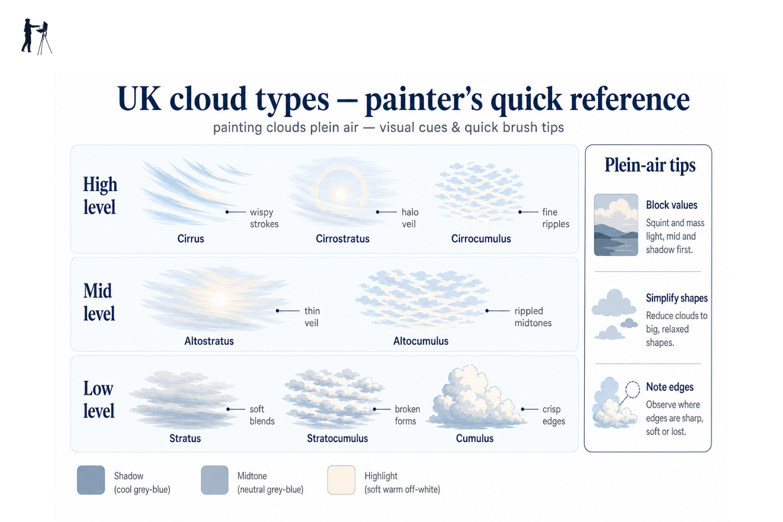
Most cloud-painting tutorials use a towering cumulus as their example: that round-bottomed, cauliflower-topped formation with satisfying light on top and deep shadow beneath. It's a perfectly reasonable teaching cloud, but it's not what most UK painters see most of the time. Knowing what you're actually looking at helps you decide how to approach it.
Here's a practical painter's guide to the formations you'll most commonly face outdoors in Britain (the Met Office cloud classification is a useful reference if you want to go deeper):
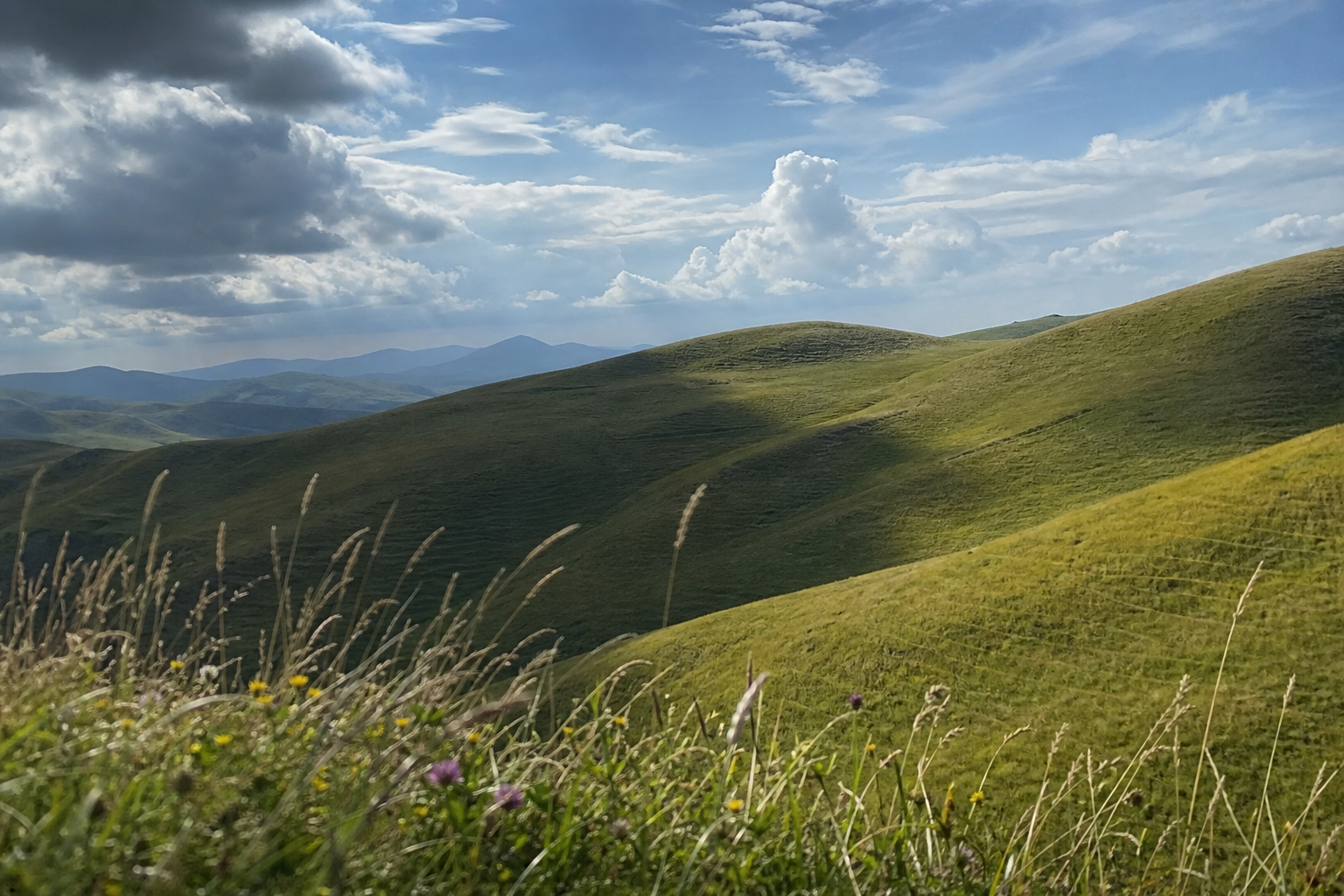
Cumulus (low-level, distinctly shaped): The "fair weather" cloud. Rounded masses with relatively clear bases, often with some value contrast between the lit tops and shadowed undersides. Most common on warm summer days with some wind. These are the most forgiving clouds to paint because they hold their basic shape long enough to observe.
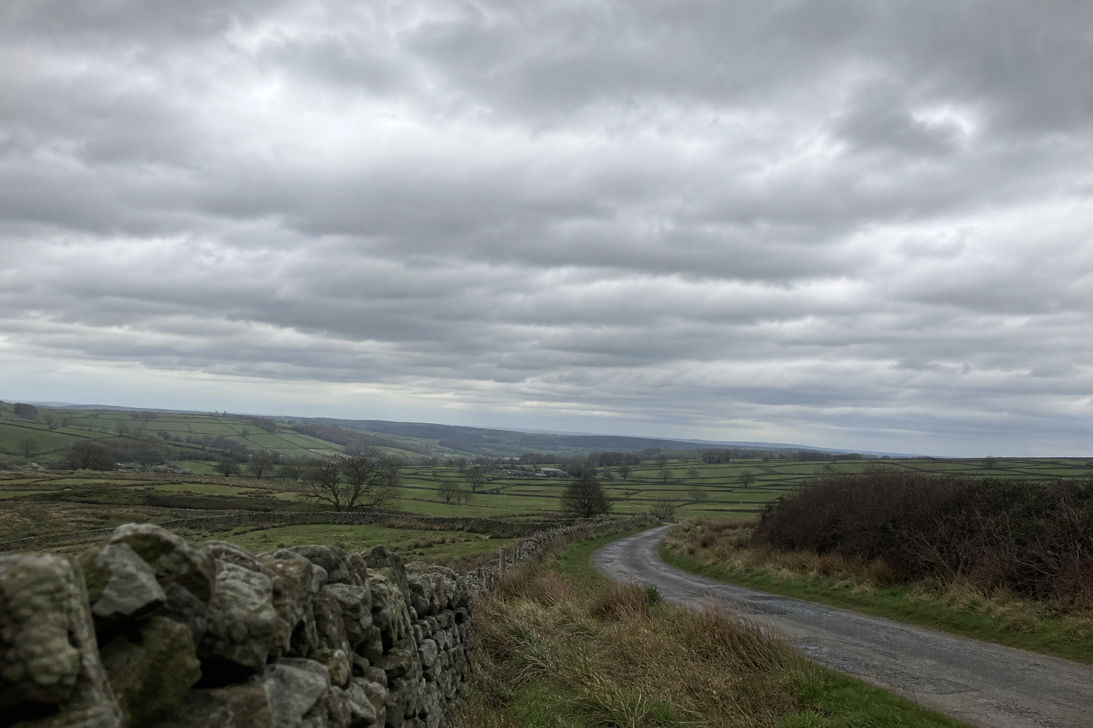
Stratocumulus (low-level, layered): The most common cloud type in British skies. Grey or white patches arranged in a layer, often covering most of the sky with occasional breaks. The contrast is lower than cumulus, the edges are less defined, and the light is diffuse. Many painters find this frustrating precisely because it offers so little apparent structure.
Altostratus (mid-level, even sheet): A fairly uniform grey or blue-grey veil that covers the whole sky. The sun may be visible through it as a bright smear, but there's no direct light and almost no shadow. Value differences across the sky are very small.
Nimbostratus (low-level, rain cloud): The dark, featureless cloud layer that brings prolonged rain. Very flat, very dark, very uniform. Not worth painting for its own drama; useful to recognise so you know to pack up rather than look for interesting shadow.
Cirrus (high-level, wispy): Thin, feathery streaks high in the sky, formed from ice crystals. Near-white against blue, with almost no value contrast. Delicate to paint; easy to overstate.
What UK Cloud Light Actually Looks Like
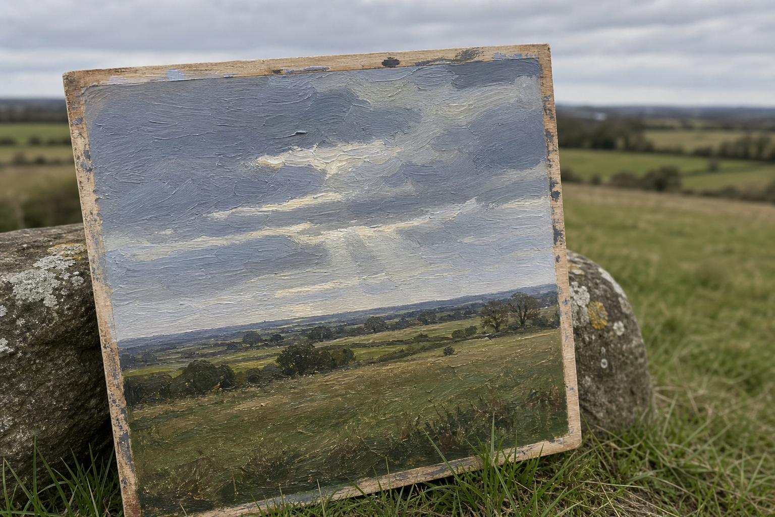
Here is the thing most tutorials don't tell you: the sky in Britain is usually much lower in contrast than the examples used to teach cloud painting. A typical stratocumulus day produces a sky where the difference between the lightest cloud and the darkest shadow is perhaps three or four value steps, not the dramatic eight or nine steps of a Mediterranean cumulus against cobalt blue.
This matters because it changes your palette. UK sky blues tend toward grey-blue or warm neutral rather than saturated cobalt. Cloud whites are rarely pure white, they're more often a warm off-white or a cool light grey. The shadows beneath clouds are not deep purples or navy; they're soft, slightly cool mid-tones.
The quality of UK light also varies by region. North Sea coastal light tends to be cooler and harder, especially on clear days. South-western coastal light is often warmer and more golden, particularly in late afternoon. Urban light in England's cities typically reads as more neutral, filtered through atmospheric haze. These aren't dramatic differences, but they're worth noting when you're mixing.
Atmospheric perspective applies to clouds as much as to landscape: clouds near the horizon are smaller, flatter, more muted in tone, and softer in edge than clouds directly overhead. Painting every cloud with the same scale and contrast is one of the quickest routes to a sky that looks unconvincing.
Sky Value Painting: Getting the Tonal Foundation Right
Sky value painting is worth treating as a distinct, named skill. It's not the same as knowing how to mix colours; it's about deciding the tonal structure of your sky before you touch a brush to canvas.
The Most Common Mistake (And How to Fix It)
The most common error with clouds outdoors is painting the sky too light overall. It seems reasonable: the sky is bright, so you reach for light tones. But if your base sky tone is already near-white, there's nowhere left to go for your cloud highlights. The clouds end up the same value as the sky around them, and the whole thing looks flat.
The fix is to reserve your lightest tones. The brightest lit edge on a cloud, the small sunlit rim that catches the eye, should be your lightest value in the sky. The blue sky itself, the grey mid-tones of cloud masses, and even the lighter cloud areas should all sit a step or two darker than that reserve highlight. This gives the sky structure and makes those bright edges sing.
A Simple Value Check Before You Start
Before mixing any cloud colour, spend thirty seconds squinting at the sky. Squinting reduces colour information and shows you the underlying value structure more clearly.
Identify the lightest tone in the whole sky (usually a small, bright cloud edge or the sun's halo) and the darkest tone (often the underside of a low cloud, or the shadow zone where clouds overlap). Decide where each of these sits on a rough scale of one to ten, where one is white and ten is near-black.
For a typical UK stratocumulus day, you might find your lightest cloud edge is around a 2, and your darkest cloud shadow is around a 5 or 6. The blue sky might sit at 3 to 4. That's a modest range, and you need to mix and paint within it rather than stretching out to extremes that aren't actually there.
Set your sky value before you touch the clouds
Before mixing any cloud colour, squint at the sky and identify your lightest and darkest tones. Decide where each sits on a rough scale of one to ten. Most of your sky should live in the mid-light range — reserve near-white only for the smallest, brightest edges.
How to Paint Clouds Plein Air in Oils
Setting Up Your Palette for the Sky
A limited palette works far better outdoors than a sprawling studio setup. For UK sky conditions, you don't need many colours; you need the right ones, and you need them in the right proportions.
A practical oil palette for UK skies
For most UK conditions, titanium white, ultramarine blue, burnt umber, and a warm red (cadmium red light or light red) gives you everything you need to mix cloud greys, sky blues, and warm underlit edges. Avoid mixing greys from black and white — the result is almost always flat and lifeless outdoors.
Keep your medium use minimal outdoors. Thinly applied paint handles better in changing temperatures, dries faster, and gives you more control over wet-into-wet blending. Overloading with linseed oil makes the paint slippery and slows drying significantly, which matters when you're painting wet clouds into wet sky.
Blocking In the Sky First
The most important habit in oil cloud painting is establishing the sky base before you touch the clouds. This gives you something to work against and means you can soften or lose cloud edges into the existing wet paint.
Oil workflow for painting clouds plein air
Choose your moment
Decide which sky configuration you're committing to. If clouds are moving, pick one arrangement and stick with it — don't chase every shift.
Lay in the sky base
Mix a mid-light value for the blue (or grey-blue) sky. Apply with a broad brush, lighter near the horizon, slightly deeper higher up. Don't use this paint wet if you want clean cloud edges.
Mass in the cloud shapes
Using a slightly cooler, greyer version of your sky mix, block in the main cloud masses as simple shapes. No outlines — think in areas of value, not line.
Establish the light and shadow zones
Add lighter, warmer tones to the tops and sunward planes of the clouds. Work darker, cooler tones into the undersides and self-shadowed areas. Keep the contrast modest — UK clouds rarely have sharp black-and-white contrast.
Refine the edges
Vary your edges deliberately. Lose some edges where cloud value meets sky, soften others with a clean dry brush, and leave a few slightly sharper accents for the brightest lit areas.
Edges: The Detail That Makes or Breaks a Cloud
Edge quality is where cloud paintings succeed or fail, and it's the area where beginners tend to go wrong in one of two ways: everything too hard, or everything too soft.
In reality, a single cloud will have several different types of edge occurring simultaneously. Lost edges (where the cloud blends into the sky so softly that there's almost no visible boundary) tend to appear on the sides of a cloud mass where it trails off. Soft edges appear on most of the illuminated surface, where the form turns gently. Hard edges are relatively rare in UK clouds, but they do appear: typically on the most brightly lit rim or the sharpest corner of a cumulus against clear blue sky.
The practical approach is to vary deliberately. Soften most edges with a clean, dry brush or a gentle drag of adjacent wet paint. Let a few edges on the lit side stay relatively firm. Actively lose edges where the cloud dissolves into the surrounding sky. The variety creates the sense of a sky that exists in atmosphere.
Cloud Shadows and the Whole Landscape
Cloud shadows are one of the most commonly missed elements in plein air sky painting. The shadow a cloud casts on the ground below it is directly related to the cloud itself: roughly the same shape, roughly the same scale, positioned according to the angle of the sun.
Outdoors, you can see this happening. A cloud passes, and a darker patch of cooler light moves across the fields below. That darker area is slightly cooler in temperature than the surrounding lit landscape, and slightly darker in value, but it's not as dark as your deepest land masses. It sits in the mid range: darker than sunlit grass, lighter than a shadow under a tree.
Painting cloud shadows on the landscape below is what connects your sky and land into a single coherent light environment. If the sky and ground feel like two separate paintings, disconnected cloud shadows are often the reason. Check that the shadow on the ground is reading as a response to the cloud above it, not as an arbitrary darker area.
A brief note on crepuscular rays: the "shafts of light" that appear when sunlight breaks through cloud gaps are a phenomenon painters are often drawn to. They're worth understanding, even if you don't always include them, because they reveal the direction of the light source and can help you understand the overall light logic of a complex sky.
Matching your shadows to your clouds
The shadow a cloud casts on the ground below should correspond in scale and position to the cloud itself. Cloud shadows are usually slightly cooler and darker than the lit landscape around them, but lighter than your darkest land masses. If ground and sky shadows feel disconnected, check they're both responding to the same light source.
How to Paint Clouds Plein Air in Watercolour
The same underlying principles apply in watercolour, but the practical approach is almost reversed in places. In oils, you build up from dark to light, adding white as you go. In traditional watercolour, you can't paint light over dark. That one difference changes everything about how you plan and execute a sky.
Working Wet-in-Wet for Natural Cloud Edges
The most effective way to achieve the soft, atmospheric edges of UK clouds in watercolour is wet-in-wet: dropping colour into paper that's already damp so the pigment spreads naturally at the boundary.
The timing is everything. Too wet, and the colour blooms uncontrollably and loses any shape. Too dry, and you get a hard tide-mark where you wanted a soft edge. The sweet spot is paper that has lost its shine but is still visibly damp. On a breezy UK day, this window can close surprisingly quickly.
Work the sky wash first, then drop in cloud shadow tones while the paper is still at the right level of damp. Don't overwork it. Let the wet-in-wet do its job; excessive brushing at this stage disturbs the paper surface and creates streaks.
Reserving the Lights
Where oils allow you to paint light areas at any point, watercolour requires you to decide where your lightest areas will be before you begin. The white of the paper is your lightest value; once you paint over it, it's gone.
Before starting any sky wash, identify the brightest cloud edges and the lightest areas you want to preserve. Leave these unpainted. It sounds straightforward, but the temptation to paint everything and "sort it out later" is strong outdoors when you're working quickly. Resist it.
Masking fluid can preserve very small highlights, but it changes the feel of the edge when removed: the boundary between masked and painted areas tends to be slightly harder than a naturally reserved edge. For most cloud shapes, working around the light areas with a controlled wash gives better results. Keep the lightest reserved areas small; they'll read as the brightest lit rims only if they're genuinely the lightest value on the paper.
Mixing Cloud Greys Without Going Muddy
Muddy greys are a near-universal watercolour problem, and they become especially visible in skies where the tones are already subtle.
Watercolour cloud greys that stay alive
For luminous cloud greys, try French ultramarine and burnt sienna in varying proportions: lean toward blue for cooler shadows, toward sienna for warmer underlit edges. Use Payne's grey sparingly; on its own it deadens the sky. Let granulating pigments work for you — they naturally suggest cloud texture without overworking.
The key principle is to mix your grey from two colours that naturally neutralise each other, rather than adding black. Ultramarine and burnt sienna is a reliable pairing: in roughly equal proportions they produce a warm neutral; shift toward blue for a cooler shadow grey, toward sienna for the warm buff of a sunlit cloud base. The slight granulation that ultramarine produces on cold-pressed paper adds a natural cloud texture for free.
Payne's grey is a useful shortcut but a risky one. It's easy to reach for it when you need a quick dark, but it has a tendency to deaden everything it touches. Use it very sparingly, or not at all.
Watercolour dries lighter than it looks when wet: factor this in when judging your values outdoors. A wash that looks exactly right when applied will often look noticeably paler once dry. This is particularly pronounced in cold weather, where drying is slower but the contrast shift can still catch you out.
Working Fast: Practical Strategies for Changing UK Skies
The speed at which conditions change is one of the defining realities of painting clouds plein air in Britain. It's not a problem to eliminate; it's a condition to work with.
| Condition | How fast it changes | Recommended approach |
|---|---|---|
| Cumulus on a windy day | Very fast (minutes) | Small panel, commit to one cloud, work from memory for subsequent passes |
| Stratocumulus layer | Slow to moderate | More working time, focus on value subtlety and soft edges throughout |
| Altostratus / overcast | Often stable | Good conditions for detailed value work; watch for light shifts as layers thin |
| Cumulonimbus / dramatic sky | Extremely fast | Quick value sketch first; paint the overall light effect rather than specific formations |
The Thumbnail Sketch Habit
Before opening a paint tube or mixing a wash, spend sixty seconds doing a rough pencil sketch of the main cloud masses. Not a detailed drawing, just a value map: which areas are light, which are mid-tone, which are dark. Where are the main shapes? Where does the sky break?
This serves two purposes. It commits the configuration to memory, so you have a reference when things change. And it forces you to make compositional decisions before you're committed to paint on a panel or paper. Many outdoor painters find that this brief pause actually saves time overall, because it replaces the confused stop-start that happens when you begin painting without a clear plan.
How to Edit Without Chasing
The practical approach to a sky that keeps changing is to decide on a configuration and stay committed to it. Paint the sky you chose to paint, not the sky as it is now.
When clouds appear or disappear during a session, the question to ask is whether the change improves or complicates the composition you've already established. If a new cloud appears where there was empty sky, you can incorporate it only if it works within your existing value structure. If it doesn't, ignore it. If a cloud you were painting disappears, work from your memory and your initial sketch to complete the shape as you saw it.
This is a different skill from accuracy, and it takes practice. The discipline is to edit in service of the painting you're making, not to transcribe every change as it occurs.
Taking Your Cloud Studies Further
Small cloud studies done outdoors have real value beyond the day you paint them. A ten-minute panel or a half-sheet watercolour sketch notes something that a photograph can't fully capture: the quality of the light, the speed of the change, the atmospheric weight of a particular sky on a particular day.
When you finish a sky study, make a brief note on the back or in a sketchbook: approximate time, direction you were facing, light conditions, cloud type if you recognised it. Over time, these studies build into a personal library of observed skies that can inform larger studio compositions without requiring you to invent what you haven't seen.
Cloud studies are also a forgiving format for focused practice. A small panel dedicated to one sky, with no landscape pressure at all, is a good way to develop the specific habits covered in this guide: the value check before starting, committing to a configuration, varying your edges, matching your ground shadows to your cloud shadows. Each study is a chance to isolate and work on one thing, then bring it forward into the next session outdoors.
The sky over Britain is rarely glamorous. But it's endlessly varied, and learning to paint it honestly, with its subtlety and its speed and its particular grey-blue light, is one of the more rewarding challenges in outdoor painting.
FAQ
Frequently Asked Questions
What limited oil palette works best for UK skies?
Use titanium white, ultramarine, burnt umber and a warm red. These mix clean greys and muted blues suited to British light. Avoid using black to make greys.
How do I keep watercolour cloud greys from looking muddy?
Mix greys from ultramarine and burnt sienna in varying ratios. Use Payne's grey sparingly. Let granulating pigments add texture and avoid overworking washes.
How do I cope with rapidly changing clouds outdoors?
Make a quick thumbnail value sketch and commit to one configuration. Work on a small panel or sheet and paint the chosen light effect rather than chasing every change.
How do I set the right tonal range for a UK sky?
Squint briefly and identify the lightest and darkest tones. Reserve near-white for the brightest cloud highlights and keep most sky values in the mid-light range.
How should cloud shadows relate to the landscape below?
Paint cloud shadows to match the cloud shape, scale and sun angle. Shadows are usually slightly cooler and darker than sunlit ground but lighter than the darkest land masses.
Author

PleinAirPainting Editorial Team
PleinAirPainting.co.uk helps artists paint outdoors with confidence through UK-focused guides, equipment advice, resources and plein air inspiration.