Atmospheric Perspective in Plein Air: How to Paint Convincing Depth Outdoors
A practical guide to using atmospheric perspective plein air. Learn the four levers, value, temperature, saturation and edge quality, plus a simple workflow to paint believable depth in UK landscapes.

Key takeaways
- • Atmospheric perspective relies on four controllable variables: value, temperature, saturation and edge quality.
- • Under UK overcast light the distance shift is subtle; observe slight cooling and greying rather than assuming blue.
- • Reduce chroma in the distance by adding complementaries or sky colour, not simply white.
- • Use edge control deliberately: crisp edges in the foreground, soft transitions in the far distance.
- • Work back to front: establish the cool, muted distance first, then build warmer, darker, sharper foregrounds.
There is a particular frustration that comes when a painting looks technically correct but somehow still flat. The proportions are right, the colours seem reasonable, and yet the distance refuses to feel distant. Atmospheric perspective is the skill that fixes this, and it is not instinct or mystery: it is a set of controllable variables that any outdoor painter can learn to apply systematically. Once you understand the four levers at work, you will see them operating in every landscape you ever set up in front of.
What Atmospheric Perspective Actually Means for Outdoor Painters
Aerial perspective, sometimes called atmospheric perspective, describes the way the atmosphere itself alters the appearance of objects as they recede from the viewer. Moisture, dust, and airborne particles scatter light between the eye and any distant surface, making far objects appear lighter in tone, cooler in colour, greyer in saturation, and softer in edge quality than objects close by. This is an optical phenomenon that follows reliable, predictable rules.
It is worth separating this clearly from linear perspective, which deals with geometry: vanishing points, converging lines, and the diminishing size of objects at distance. Both create a sense of depth, but they operate entirely differently. You can get the linear geometry perfect and still produce a flat painting if the atmospheric relationships are wrong. Painters like Turner and Constable understood that tonal and chromatic recession could convey depth more powerfully than any geometric construction, and their work still demonstrates this convincingly.
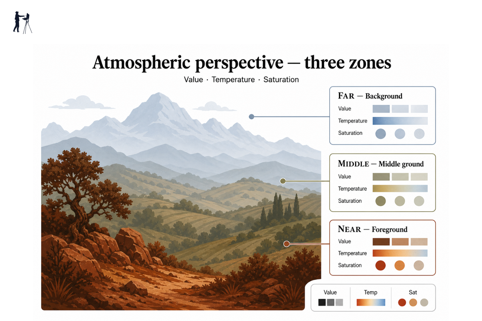
For practical purposes, atmospheric perspective comes down to four variables: value, colour temperature, saturation, and edge quality. Control these across your distance zones and depth will follow.
Why This Looks Different on an Overcast UK Day
Here is where a lot of UK painters hit trouble. The standard advice about aerial perspective is that the distance goes blue. In a sun-baked Mediterranean or American Southwest landscape, that is often literally true, and the shift is obvious enough to be hard to miss. Under British cloud cover, the principle still holds, but the visual result is much more subtle.
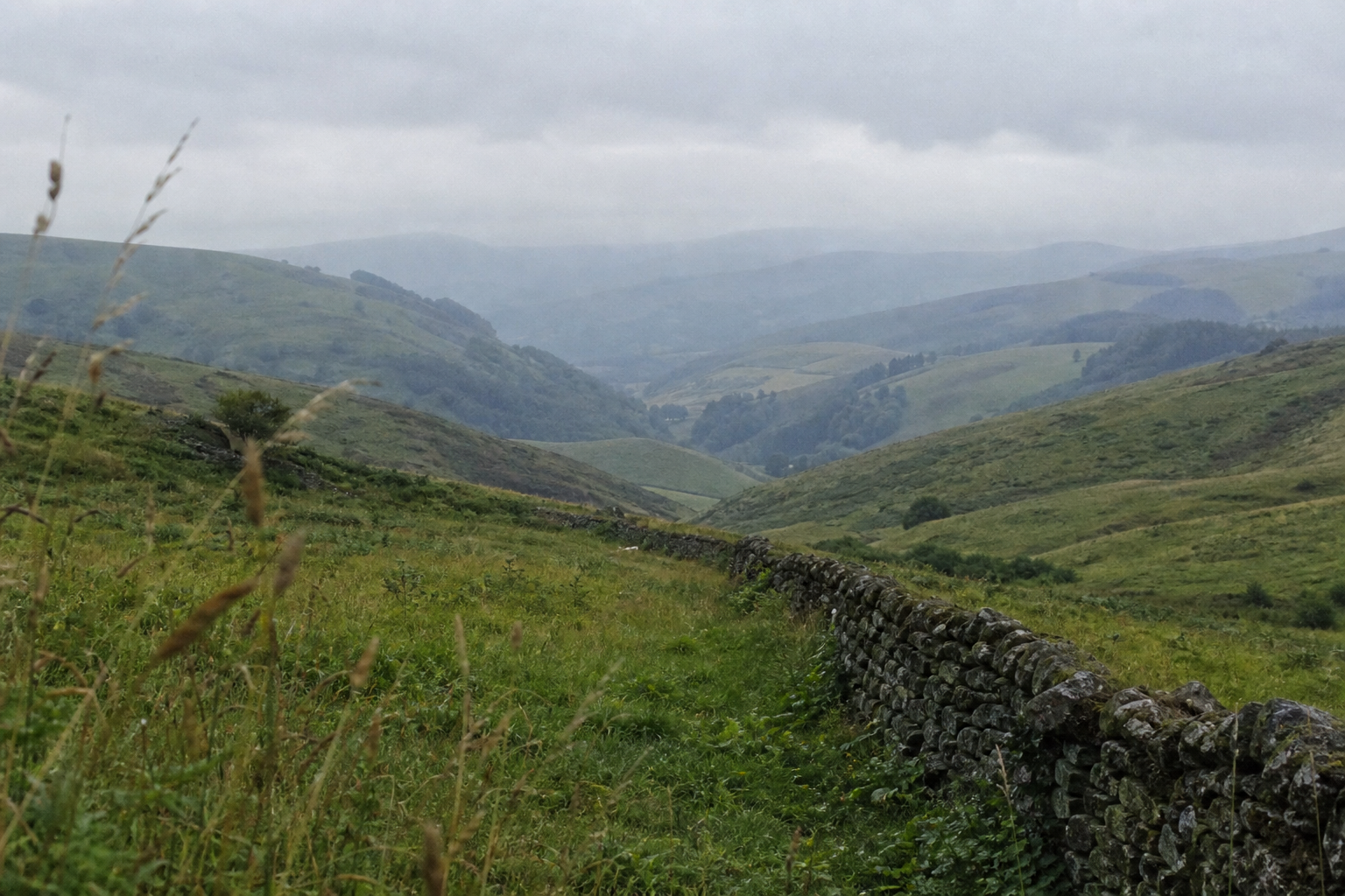
On an overcast day in the Yorkshire Dales or across the Pembrokeshire coastal hills, the atmosphere is still doing its work. But instead of a warm foreground against a vivid blue-grey horizon, you are looking at a warm or neutral grey foreground against a slightly cooler, slightly lighter, slightly more lavender-grey distance. The shift is real; it is just quieter. Painters who apply the Mediterranean formula under British light end up with distances that are too assertively blue and that read as painted rather than observed.
The rule is to look at what is actually in front of you, not to apply a fixed formula. In very flat UK light, the temperature shift may be just a degree or two warmer to slightly cooler. Trust what you see.
The Four Levers You Control
Think of these as four independent controls you can adjust for each zone of the landscape. They work together, and the most convincing spatial recession usually comes from using all four in combination rather than relying heavily on just one.
The painter's rule of thumb
Foreground: warm, dark, saturated, sharp. Distance: cool, light, muted, soft. Apply this to every zone in the landscape, not just the horizon.
Value (Tone)
Tonal compression is one of the most reliable tools in landscape painting. In the foreground, you have the full range available to you: deep, rich shadows alongside your brightest lights. As the eye travels back through the middle distance and towards the horizon, that tonal range compresses. The darks become lighter and the lights darken slightly, both converging towards a mid-tone. The very horizon often sits within a surprisingly narrow tonal band.
The practical implication is that you should not give the distance the same tonal drama as the foreground. A dark, punchy shadow in the far hills will immediately pull it forward and flatten the painting. Conversely, a very bright, high-key highlight in the foreground will push it forward in space, which is generally what you want. Manage the tonal range in each zone and the depth reads itself. For more on building tonal structure into your outdoor studies, the principles of light and shadow in plein air painting work closely alongside atmospheric recession.
Colour Temperature
Foreground objects tend to carry warmer colours; distant objects cool down. In practice for UK landscape painters, this often means warm yellow-greens, ochres, and raw umbers in the immediate foreground, with those colours progressively shifting through neutral green and into blue-green, grey-green, or grey-mauve at the far distance.
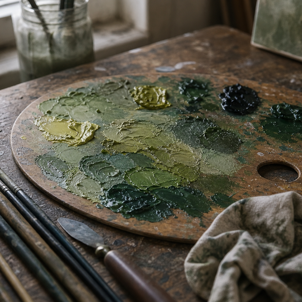
The green problem is a genuine pain point outdoors. When the whole scene is green from foreground to horizon, it is tempting to paint it all with the same green mix and then wonder why the painting looks like a flat carpet. The solution is to look for the temperature within the green. Foreground grasses lit by even weak sunlight tend towards yellow-green. The mid-distance field is a cooler, more neutral green. The far hills are often blue-grey-green, sometimes almost no green at all, trending into a cool grey or mauve. These shifts are always there; the eye just needs training to find them.
Saturation (Chroma)
Saturation reduces with distance. The colours you see at the horizon are greyed, neutralised versions of their local colour. This is one of the most commonly ignored levers and probably the single most common cause of flat-looking paintings.
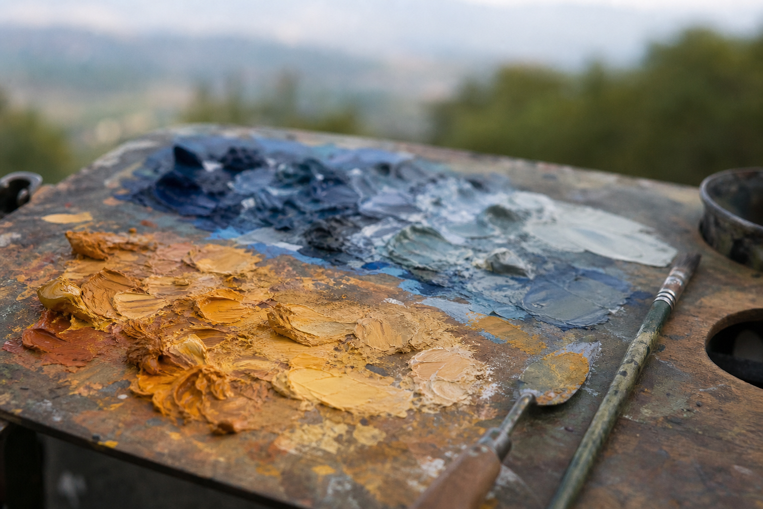
Two practical methods for knocking back chroma in your distance mixes. The first is to mix in a small amount of the complementary colour: a little red or orange into a green, a touch of green into a red. This dulls the hue without dramatically shifting its tone. The second is to add a pool of your sky colour into the mix. This is particularly effective because the sky colour is already doing the work of unifying the distance, and it naturally cools and greys the mix at the same time.
Avoid the trap of adding white to grey a colour down. White lifts the tone and can make a colour chalky, but it does not cool or grey it in the way that atmospheric recession actually works. It is a different operation. Use white to adjust tone; use complementary mixing or sky colour to reduce chroma.
Edge Quality
Hard edges advance; soft edges recede. This lever is often treated as an afterthought, but it is one of the most powerful spatial tools you have.
In the foreground, edges can be crisp and confident: the sharp line where a dry stone wall meets the sky, the clear edge of a nearside gate post. In the far distance, those same kinds of edges dissolve into soft transitions. Tree lines on a distant ridge often have no discernible hard edge at all; they simply blur into the sky or fade into the hill behind them.
You control edge quality with brush pressure, paint consistency, and deliberate softening with a clean brush or fingertip. The key word is deliberate. Soft edges in the far distance are a decision, not an accident of being loose. Make them consciously.
Chromatic Perspective: Using Colour to Push and Pull Space
Chromatic perspective works alongside atmospheric perspective and is worth understanding as a distinct tool. The underlying principle is that warm colours appear to advance towards the viewer and cool colours appear to recede. This is partly a function of how the eye focuses at different wavelengths, but for practical painting purposes, all that matters is that it is real and usable.
Think of a wooden gate or a sandstone farm building in the immediate foreground: warm ochre, raw sienna, perhaps a touch of red-brown. Behind it, a hedgerow in cooler grey-green. Behind that, a hillside in greyer blue-green, and behind that, a distant ridge that is nearly grey. Each step back brings a cooler, quieter hue. The warm gate post sits in front because of its colour as much as because of its size or detail.
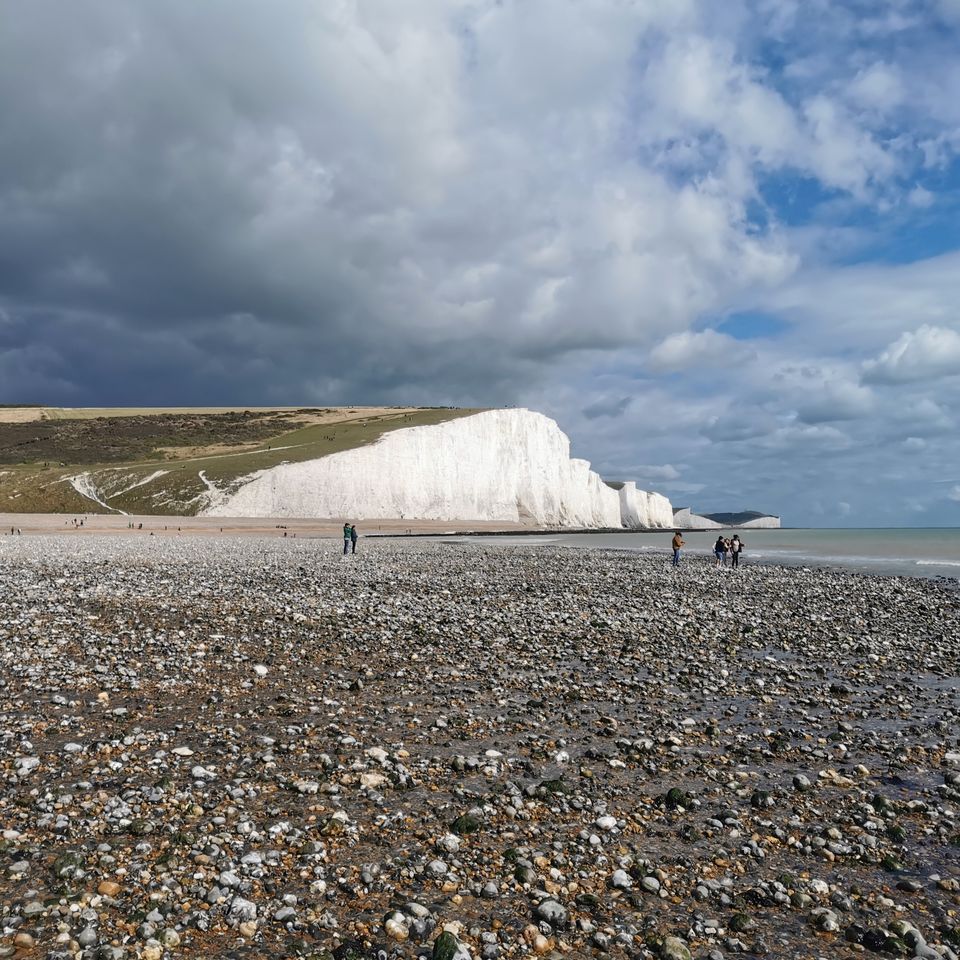
On the coast, this works clearly: warm sandy cliffs in the foreground, a cooler grey-blue sea in the middle distance, and a pale, almost white or cold grey headland at the far end of the bay. In Northumberland or along the Gower, this recession from warm to cool can be very pronounced, especially in low raking light.
For British greens specifically: yellow-green in the foreground, neutral green in the middle distance, blue-green or grey-green at the far hills. If you can only make one chromatic adjustment to a green-dominated landscape, this is it.
A word of caution: chromatic perspective is most effective when it works in combination with value and saturation changes. A distant object that is cool in colour but tonally very dark and sharply edged will still read as near. All four levers need to be pointing in the same direction.
| Zone | Value | Temperature | Saturation | Edges |
|---|---|---|---|---|
| Foreground | Darkest darks, brightest lights | Warmest | Highest | Sharpest |
| Middle distance | Mid range | Neutral | Reduced | Softening |
| Far distance | Lightest, compressed | Coolest (blue-grey, mauve-grey) | Lowest | Softest, lost |
A Simple Outdoor Workflow for Applying Atmospheric Perspective
Knowing the principles is one thing; having a repeatable process for using them on site is another. Here is a workflow you can follow from the moment you unpack your kit.
Atmospheric perspective outdoors: a session workflow
Divide your scene into three zones
Before touching paint, identify foreground, middle distance and far distance. Decide where each zone sits on your canvas.
Mix your sky and distance colour first
Mix a generous pool of your sky tone. This becomes the base you add to all distance mixes. Do not under-mix — you will need more than you think.
Paint the far distance first
Use your lightest, coolest, most muted mixes. Soft edges, broad strokes. Resist adding detail.
Work forward through the middle ground
Gradually warm the temperature, strengthen the contrast, and allow slightly crisper edges. Increase saturation incrementally.
Finish in the foreground
Strongest darks, warmest hues, sharpest edges, most saturated colour. Your foreground anchors the whole painting.
Step back and check the depth read
Does the eye travel from foreground to distance? If it stalls, check whether a zone is too saturated, too warm, or too detailed relative to the zones in front of it.
Painting back to front keeps you honest. When the far distance is already placed correctly as light, cool, and muted, it is much easier to judge whether the foreground is warm and strong enough by comparison.
Common Mistakes and How to Fix Them
Most of these will be recognisable from your own work. They are not failures of talent; they are predictable traps that disappear once you know to look for them.
Over-saturating the distance. This is the most common error by far. Vivid, saturated colour in the far hills is very attractive to mix but kills depth instantly. If your far distance looks lively and colourful, it almost certainly needs greying back. Add the complementary, or stir in some sky colour.
Adding too much detail in the background. The eye reads detail as nearness. A carefully observed tree at the far end of a field will jump forward in space the moment you start defining individual branches. Reserve your detail for the foreground. In the far distance, use broad, soft strokes and let the paint sit.
Confusing atmospheric and linear perspective. Atmospheric recession is about tone, colour and edge. It has nothing to do with vanishing points. You can apply it in a scene with no geometric recession at all: a flat salt marsh, an open sea view, a hill viewed straight on. Keep the two systems separate.
Losing the plan when the light changes. UK conditions mean the light rarely stays the same for a whole session. If a cloud rolls in and flattens the foreground colours you were relying on, it can throw the whole tonal logic off.
When the light changes on you
Decide on your atmospheric plan in the first ten minutes and commit to it. Write down your value zones if it helps. The light will move, but your painting's depth logic should stay consistent throughout the session.
Under-mixing paint and running short of sky colour. The sky tone that feeds into all your distance mixes is used far more than expected. Mix at least twice as much as you think you need. Running dry halfway through a session forces compromises that undermine the whole atmospheric structure.
Practising Atmospheric Perspective: Three Exercises to Try Outdoors
Reading about depth is useful; practising these exercises on your next session will make the principles tangible very quickly.
Exercise 1: The value-only distance study. Set up with a severely limited palette: just black and white in oils, or a single pigment in thin washes for watercolour. Paint only the tonal relationships across your three zones, ignoring colour entirely. This forces you to see tonal compression clearly without the distraction of hue or saturation. A single session like this will recalibrate how you see value in the landscape.
Exercise 2: The chroma reduction exercise. Mix your most saturated green or earth tone for the foreground zone. For the middle distance, take some of that mix and add just enough of the complementary colour, or a sliver of sky grey, to knock it back noticeably. For the far distance, reduce it again. Use each mix in its corresponding zone. This exercise isolates saturation as a variable and shows precisely how much depth chroma control alone can create, even when value and temperature are barely shifted.
Exercise 3: The edge quality walk. Before you put any paint down, stand in front of your scene and deliberately trace where you can see hard edges and where edges dissolve or disappear. Notice how almost all the crisp, clearly defined edges are in the foreground, and how the far distance is largely made of transitions rather than lines. Then, when you paint, make a conscious decision to soften every edge in the far distance, even those where you think you can see detail. This one exercise, done a few times, can change how you handle edges permanently.
Atmospheric Perspective Across UK Landscapes
Painting distance in plein air works differently depending on where you are. Here is how the principles translate across the kinds of locations UK painters actually work in.
Rolling hills and farmland. In the South Downs, the Cotswolds, or the Dales, the classic layered tonal band structure is often very visible: warm, darker greens in the foreground, progressively lighter and cooler bands of green and grey into the distance, with the far hills often barely distinguishable from the sky. The challenge is resisting the urge to add tonal drama to those far bands. Let them sit quietly.
Coastal scenes. Cornwall, Pembrokeshire, Northumberland: strong atmospheric haze is common, and on bright days the distant headlands and sea can appear almost bleached, very pale and cool. The sea itself is often cooler in colour than the sky above it, and coastal mist can flatten and neutralise the far distance very significantly. Pay attention to how little contrast remains at the horizon. The near-foreground rocks or beach in warm sandy or ochre tones will do a great deal of the heavy lifting by contrast.
Overcast and grey-sky days. This is the condition most UK painters work in most of the time. Recession still happens; it is just quieter. On a flat grey day in the Brecon Beacons or across moorland in the Peak District, the distance shifts from a warm neutral grey foreground towards a slightly cooler, slightly lighter grey-mauve or blue-grey at the horizon. These shifts are small. Look harder than you think you need to.
Urban plein air. Cities and towns offer their own version of aerial perspective, often more pronounced than people expect. Buildings recede into pollution haze and general atmospheric murk. Near facades have warmer, more detailed tones; distant buildings flatten to cool, pale silhouettes. The same four levers apply: compress the tone, cool the temperature, reduce the saturation, soften the edges.
UK light genuinely does behave differently from the landscapes where the classical rules of aerial perspective were codified. Much of the foundational thinking came from painters working in stronger, more directional light. Trust what your eyes show you in your particular landscape. The principles are universal; the specific colour relationships you find will be your own.
Putting It Into Practice
Atmospheric perspective is not something you either have or do not have. It is a set of habits built through repeated observation and deliberate practice. The painters whose work makes you feel a sense of distance and air did not achieve that by accident; they learned to look for these relationships systematically and to translate them through controlled decisions at the easel. You can do the same. Set up, divide your scene into zones, and apply the four levers. The depth will come.
FAQ
Frequently Asked Questions
What is atmospheric perspective in plein air painting?
It is the way the atmosphere alters tone, colour, saturation and edge quality so distant objects appear lighter, cooler, greyer and softer than nearby ones.
How does UK overcast light change the usual 'blue distance' rule?
Under grey UK skies the shift is subtler: distances often move to a slightly cooler, lighter grey-mauve or lavender-grey rather than a vivid blue. Trust careful observation over fixed formulas.
What are the four levers to control depth outdoors?
Value (tonal compression), colour temperature (warm foreground to cool distance), saturation (chroma reduction with distance) and edge quality (sharp foreground, soft background).
How can I reduce chroma in distant mixes without making them chalky?
Mix a little complementary colour or add some of the sky colour to neutralise hue. Avoid using white to grey down a colour because it lifts tone and can look chalky.
What is a simple on-site workflow to apply atmospheric perspective?
Divide the scene into three zones, mix the sky first, paint the far distance with light cool muted mixes, work forward through the middle ground, then finish the warm, detailed foreground.
Author

PleinAirPainting Editorial Team
PleinAirPainting.co.uk helps artists paint outdoors with confidence through UK-focused guides, equipment advice, resources and plein air inspiration.