Limited Palette Plein Air Painting: Colours That Travel Well
Use a three- to five-colour limited palette for faster plein air sessions and natural colour harmony. Pre-mix key mixes, set out a consistent palette, and resist adding tubes mid-session.

Key takeaways
- • A limited palette speeds decision making and creates natural colour harmony outdoors.
- • Three practical structures: triad, four-to-five colour core, and warm/cool primaries.
- • Key UK mixes: ultramarine plus burnt sienna for greys, and small amounts of earths to mute greens.
- • Prepare at home by pre-mixing key secondaries and use a consistent palette layout outdoors.
- • Adjust emphasis by season and use clean mixing habits to avoid muddiness.
You arrive at the location, set up your easel, and then stare at your palette. Too many colours. Too many decisions. By the time you have figured out where to start, the light has shifted and the moment has gone. Most painters who struggle outdoors are not struggling because they lack skill; they are struggling because they brought too many options.
Limited palette plein air painting is the answer, and it is not a compromise. It is a system. Working with a small, carefully chosen set of colours removes the decision paralysis, speeds up your mixing, and produces paintings with a natural coherence that full palettes rarely achieve. The painters you admire most almost certainly work with fewer colours than you think.
This guide gives you a clear rationale, practical palette structures you can set up before your next session, and specific mixes for the colours that actually matter in British landscapes. By the end, you will have everything you need to get outside with confidence.
Why a Limited Palette Works Better Outdoors
Colour harmony comes for free
When every colour in your painting comes from the same small group of pigments, they share an underlying relationship. The greens in your hedgerow, the grey of an overcast sky, and the warm brown of a ploughed field all contain echoes of the same parent colours. That shared DNA is what gives a painting visual unity. With a full palette, you are constantly fighting the risk that a colour from one part of the scene looks completely disconnected from another. With a limited colour palette for plein air work, harmony happens naturally as a byproduct of the constraints you have set yourself.
Faster decisions when the light is changing
UK weather does not wait. A cloud shifts, the shadows disappear, the quality of the light changes entirely within minutes. Working with fewer colours means you spend that time looking at the scene rather than deliberating between Prussian blue and cerulean. Experienced painters who have settled on a small palette will tell you that the simplification is liberating rather than limiting: you stop thinking about which tube to reach for and start thinking about what you are actually seeing.
It teaches you to mix, not just squeeze
A full palette lets you find an approximate colour without really mixing. A limited palette offers no such shortcut. You have to understand how your colours interact, how to shift temperature with small adjustments, how to use value relationships to make a painting read correctly. This is where the real skill development happens. Painters who learn on a restricted palette develop an eye for temperature and tone that those who reached for convenience colours never quite build in the same way.
Three Palette Structures to Choose From
Not everyone is starting from the same place, so the following three options are structured in order of simplicity. Read through all three before deciding; you may find the second option is the right fit even if you are relatively new to outdoor painting.
| Palette | Colours | Best for |
|---|---|---|
| Three-colour triad | One yellow, one red, one blue + titanium white | Building mixing confidence from scratch |
| Four-to-five colour core | Triad + one earth (e.g. burnt sienna) + white | Most UK landscapes, general outdoor work |
| Warm/cool primaries + earths | Two versions of each primary + yellow ochre + burnt sienna + white | More experienced painters wanting greater range |
The Three-Colour Triad (Plus White)
A triad is simply one yellow, one red, and one blue, chosen so that together they can produce a reasonable range of secondaries and muted neutrals. It is a deliberately constrained starting point.
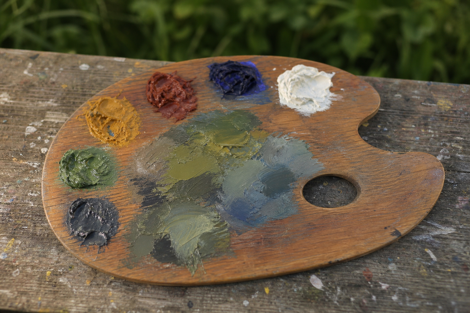
A workable triad for outdoor landscape work: cadmium yellow (a warm, opaque yellow), cadmium red (a warm mid-red) or quinacridone rose (a cool, transparent red that gives cleaner purples), ultramarine blue (a warm, granulating blue that mixes well for dark greens and warm greys), and titanium white. That is four colours in total.
Think of the three-colour triad as a training structure as much as a permanent palette. Painting a complete outdoor study with just three colours plus white forces you to understand what those pigments can and cannot do. Plenty of experienced painters return to the triad deliberately, precisely because the limitation sharpens their decision-making.
The Four-to-Five Colour Core
This is the palette structure most UK plein air painters will find genuinely useful across the widest range of conditions and subjects. Take the triad above, add burnt sienna (a warm, transparent earth colour), and you have covered most of what a British landscape asks of you.
What does burnt sienna add? Warmer, quieter neutrals that come together faster. Mixed with ultramarine, it produces the quiet blue-grey of an overcast sky, the warm grey of dry stone, and the dark cool brown of shadows in hedgerows. Added to your blue-yellow green mixes, it knocks back the saturation and gives you the kind of complex, slightly dusty green you actually see in British fields rather than the vivid result you get from mixing straight off the tube.
Some painters add yellow ochre (a flat, warm, semi-transparent earth) as a fifth colour, particularly for chalk downland or moorland subjects where the vegetation runs to muted khaki-greens and warm tan grasses. This five-colour version: cadmium yellow, cadmium red or quinacridone rose, ultramarine, burnt sienna, yellow ochre, and titanium white, is a practical default that handles all four seasons with minor adjustments to emphasis.
Warm and Cool Primaries (Six to Eight Colours)
This structure suits painters who already have a working grasp of mixing and want to extend the range of hues available without abandoning the discipline of a restricted palette.
The idea is to carry two versions of each primary: a warm and a cool. For yellow: cadmium yellow (warm) and lemon yellow (cool). For red: cadmium red (warm) and quinacridone rose (cool). For blue: ultramarine (warm) and cerulean or cobalt blue (both relatively cool and lighter in tone). Add yellow ochre, burnt sienna, and titanium white.
This gives you somewhere between seven and eight colours, but it is still a genuinely limited palette in the sense that matters: all your mixes share the same parent pigments, and you are still working from a structured set rather than reaching for whatever seems nearest. The key difference from the core palette is that you can achieve cleaner secondary colours when you need them, because you are mixing a warm version of one primary with a cool version of another. This matters less in UK conditions than it does in stronger Mediterranean light, but it gives you more flexibility in high summer when shadows occasionally read more vividly.
Mixing the Colours That Actually Matter in UK Landscapes
Getting Greens Right Without Tube Greens
This is the single frustration most UK landscape painters mention. They mix a blue and a yellow, arrive at a bright grass-green, and put it on the canvas only to find it looks nothing like the hedgerow in front of them.
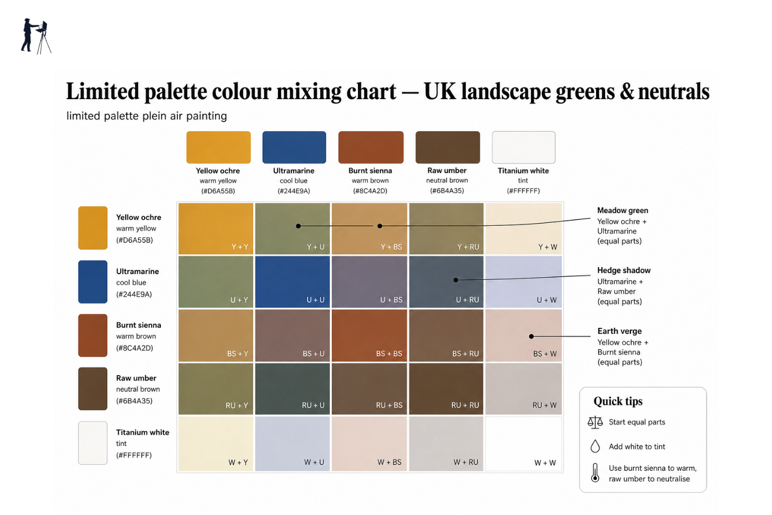
The problem is that most tube greens and most unmodified blue-yellow mixes are too saturated and too simple to read as convincingly British. UK greens are complex: layered with brown, grey, and gold depending on the season, the light, and whether you are looking at managed grassland, ancient woodland, or open moorland. Here are the key mixes to build from:
- Ultramarine and cadmium yellow produce a deep, rich green that works for hedgerows in shadow and dark foreground vegetation
- Lemon yellow and ultramarine give a cooler, lighter green that reads well for distant fields under an overcast sky
- Either of those mixes with a small amount of burnt sienna added produces a muted, earthy green for moorland vegetation and autumnal grass
- Yellow ochre and ultramarine together give a warm, quiet khaki-green that is exactly right for chalk downland, dried summer grass, and lichen-covered stone
Mixing greens for British landscapes
The secret to convincing British greens is adding a small amount of burnt sienna or yellow ochre to your blue-yellow mix. This knocks back the saturation and gives you the slightly dusty, complex green you see in hedgerows and moorland rather than the bright grass-green of a paint chart.
Quiet Greys for Skies, Stone, and Distance
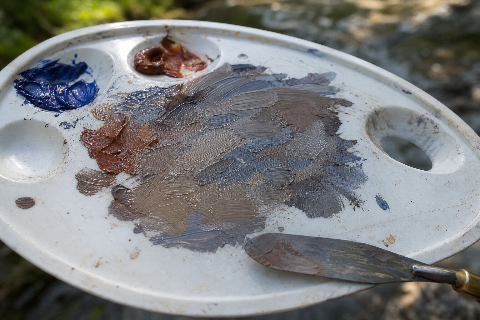
If there is one pair of colours that earns its place on a UK plein air palette more than any other, it is ultramarine and burnt sienna. Together they produce a complete range of muted greys and neutrals: lean toward the blue and you get a cool, slightly violet grey ideal for overcast skies and distant hills; lean toward the burnt sienna and you arrive at a warm brown-grey that reads perfectly for stone walls, wet mud, and shadowed earth. Vary the proportions and add white to adjust value.
This single pair covers overcast skies across the full year, the warm and cool variants of dry stone walls in northern England and Scotland, the distant tonal recession of a wooded valley, and the grey sheen of rain-wet coastal paths. The fact that it does all of this from just two pigments is exactly why a limited palette produces coherent results: those related greys will sit comfortably next to each other in the painting because they share the same parent colours.
Neutrals and the Muted Middle Ground
A large proportion of any British landscape sits in a quiet middle zone: the brownish-green of bracken, the buff-grey of dried seedheads, the olive-brown of lichen, the complex dull greens of mature hedgerows. This zone is where painters with too many colours struggle most, because they keep reaching for something that seems closer to what they are seeing and ending up with overworked, muddy passages.
With a limited palette, this middle ground largely takes care of itself. Because all your mixes come from the same pigment family, the in-between colours you arrive at through mixing naturally harmonise with the stronger notes in the rest of the painting. The muted neutrals are not a problem to solve; they are the palette doing exactly what it is designed to do.
How to Set Up Your Limited Palette Before You Go Out
The session does not start when you arrive at the location. It starts at home, before you leave.
Setting up your limited palette for a session
Choose your palette structure
Pick whichever option matches your experience level: triad, four-to-five colour core, or warm/cool primaries. Commit to it for the session.
Pre-mix your key secondaries at home
Before you leave, test your main mixes on a scrap board: your greens, your sky grey, your warm neutral. Note the ratios that work so you are not guessing in the field.
Lay your palette out consistently
Use the same layout every time: warm colours to one side, cool to the other, white in the corner. Muscle memory helps when you are working fast outdoors.
Start with your largest masses
Once outside, mix the dominant colour areas first: sky, main ground plane, largest shadow. Match value by squinting. Paint those masses before adding detail.
Resist adding new colours mid-session
If something is not working, adjust your ratios before reaching for a new tube. Nine times out of ten, a temperature or value shift is the fix.
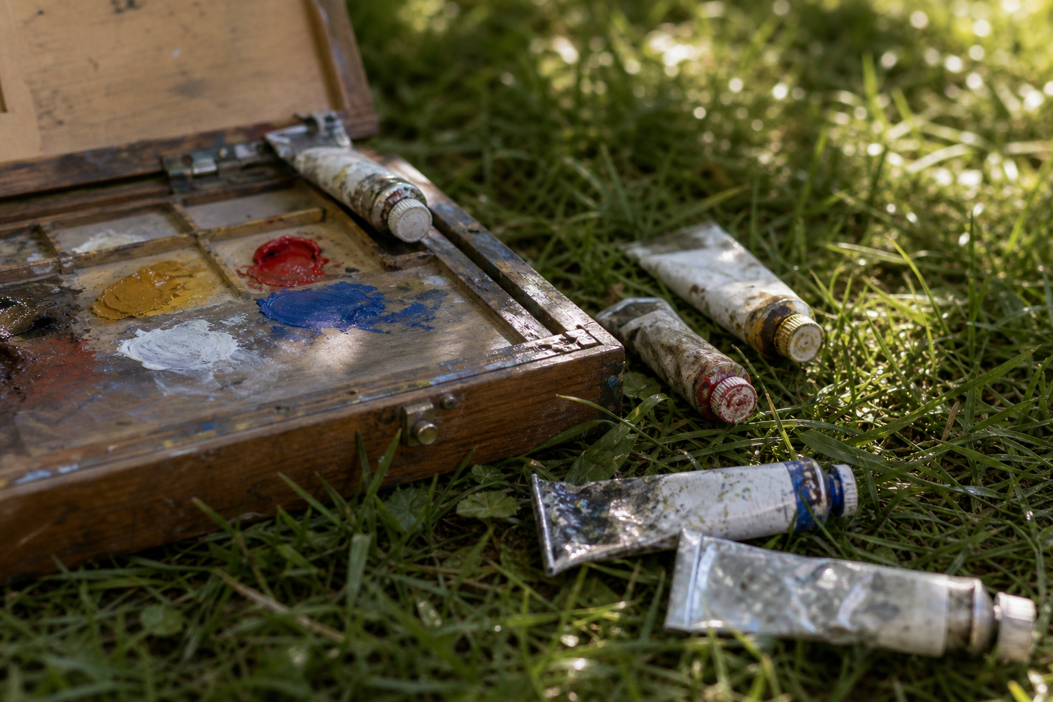
Pre-mixing at home is particularly useful for the mixes you will use most: your default sky grey, your mid-green, and your warm neutral. Ten minutes of testing the night before a session means you arrive knowing roughly what proportions work for those key areas. It also removes the anxiety of not knowing where to start once you are outside and the light is already doing something interesting.
Adapting Your Limited Palette to the Season
One of the more reassuring things about working with a core limited palette is that it does not need to be replaced each season. The same four or five colours handle all of the UK year with shifts in emphasis and ratio rather than entirely different sets of tubes.
| Season | What changes | Palette tweak |
|---|---|---|
| Spring | Bright acid greens, blossom, changeable light | Lean toward lemon yellow; add a touch of quinacridone rose for blossom passages |
| Summer | Deeper greens, stronger shadows, occasional warm light | Yellow ochre becomes more useful; test warm/cool green pairs |
| Autumn | Burnt oranges, russet browns, softer light | Burnt sienna earns more weight; reduce lemon yellow, lean to cadmium |
| Winter | Stripped back landscape, cool greys, muted earth tones | Ultramarine and burnt sienna do most of the work; titanium white gets heavy use |
In spring, the yellows get brighter and cooler; lemon yellow handles the sharp acid greens of new growth better than cadmium. In summer, yellow ochre earns more real estate on the palette as greens deepen and warm. Autumn tilts the whole palette toward the warm end: burnt sienna starts appearing in almost every mix. By winter, the landscape strips back to its structural bones and the ultramarine-burnt sienna pairing does most of the heavy lifting, with titanium white called on constantly for the pale, cool light of low-sun days.
Troubleshooting: When Your Limited Palette Is Not Working
| Problem | Likely cause | Fix |
|---|---|---|
| Muddy, dull passages | Over-mixing or too many pigments in one mix | Keep mixes to two pigments plus white; remix fresh rather than reworking on the canvas |
| Garish, plastic-looking greens | Mixing too clean; not modifying with an earth | Add a small amount of burnt sienna to knock saturation back |
| All my colours look the same | Value range is too narrow; mixing in the middle | Push darks darker and lights lighter before evaluating hue |
| Highlights look chalky | Too much white added too early | Mix value first, then modify hue; use white sparingly in the darks |
The most common cause of muddy colour
Muddiness is almost never caused by having too few colours. It usually comes from over-mixing on the palette, letting dirty brushes contaminate mixes, or combining too many pigments in one go. A limited palette with clean mixing habits produces cleaner colour than a full palette used carelessly.
Muddy colour in particular tends to make painters reach for more tubes in the hope that a new colour will fix the problem. It rarely does. The issue is almost always in the mixing process: mixes made from three or more pigments lose clarity fast, dirty brushes transfer unwanted colour into fresh mixes, and reworking wet passages on the canvas stirs colours together rather than laying one cleanly over another. Addressing these habits will do more for colour quality than adding any new tube to your palette.
A Note on Solvents and Outdoor Painting
For painters working in oils outdoors, solvents are worth thinking about before you head out. Water-mixable oils (available from most UK suppliers including Jackson's Art and Cass Art) remove the need to carry solvents entirely, which simplifies your kit and removes any concern about using spirits in public places, nature reserves, or near water.
If you work in traditional oils, a small amount of odourless mineral spirits is preferable to turpentine when painting in public places or protected locations such as National Parks, SSSIs, or coastal paths. Turpentine has a strong odour and can cause issues in enclosed or sensitive environments.
Some painters working on shorter sessions simply work straight from the tube without any medium at all. Oil paint straight from the tube has enough body to lay down directly, and avoiding solvents entirely is a practical choice that many plein air painters make as a matter of habit. It also means one less thing to carry and one less thing to accidentally knock over.
The limited palette is not a beginner's workaround. Many painters with decades of outdoor experience have used the same five or six colours for most of their working lives, and not because they could not afford more. The constraint itself is part of what makes the practice work. Pick one of the three structures in this guide, test it on your next outing, and resist adding more tubes until you have genuinely pushed the palette you have as far as it will go. You may find you never need to.
FAQ
Frequently Asked Questions
What is limited palette plein air painting?
It is painting outdoors with a small, fixed set of pigments to speed decisions, produce coherent mixes, and train your eye for temperature and value.
Which palette should I start with?
Begin with the three-colour triad plus white to learn mixing. For most UK work use the four-to-five colour core; advanced painters may prefer warm and cool primaries.
How do I mix convincing British greens?
Mix ultramarine with cadmium or lemon yellow for base greens, then add a little burnt sienna or yellow ochre to mute saturation and get the dusty, complex greens of UK landscapes.
How should I set up my palette before a session?
Choose your palette structure, pre-mix key secondaries at home, lay out warm colours on one side and cool on the other with white in a corner, and note ratios for reuse in the field.
How do I avoid muddy or dull mixes?
Keep mixes to two pigments plus white, avoid dirty brushes, remix fresh rather than reworking wet passages, and adjust value before changing hue.
Author

PleinAirPainting Editorial Team
PleinAirPainting.co.uk helps artists paint outdoors with confidence through UK-focused guides, equipment advice, resources and plein air inspiration.