How to Mix Natural Greens for Plein Air Landscapes
Practical guide to mixing natural greens for plein air landscapes. Learn palette choices, mother mixes, muting strategies and a value-first approach for convincing British greens.

Key takeaways
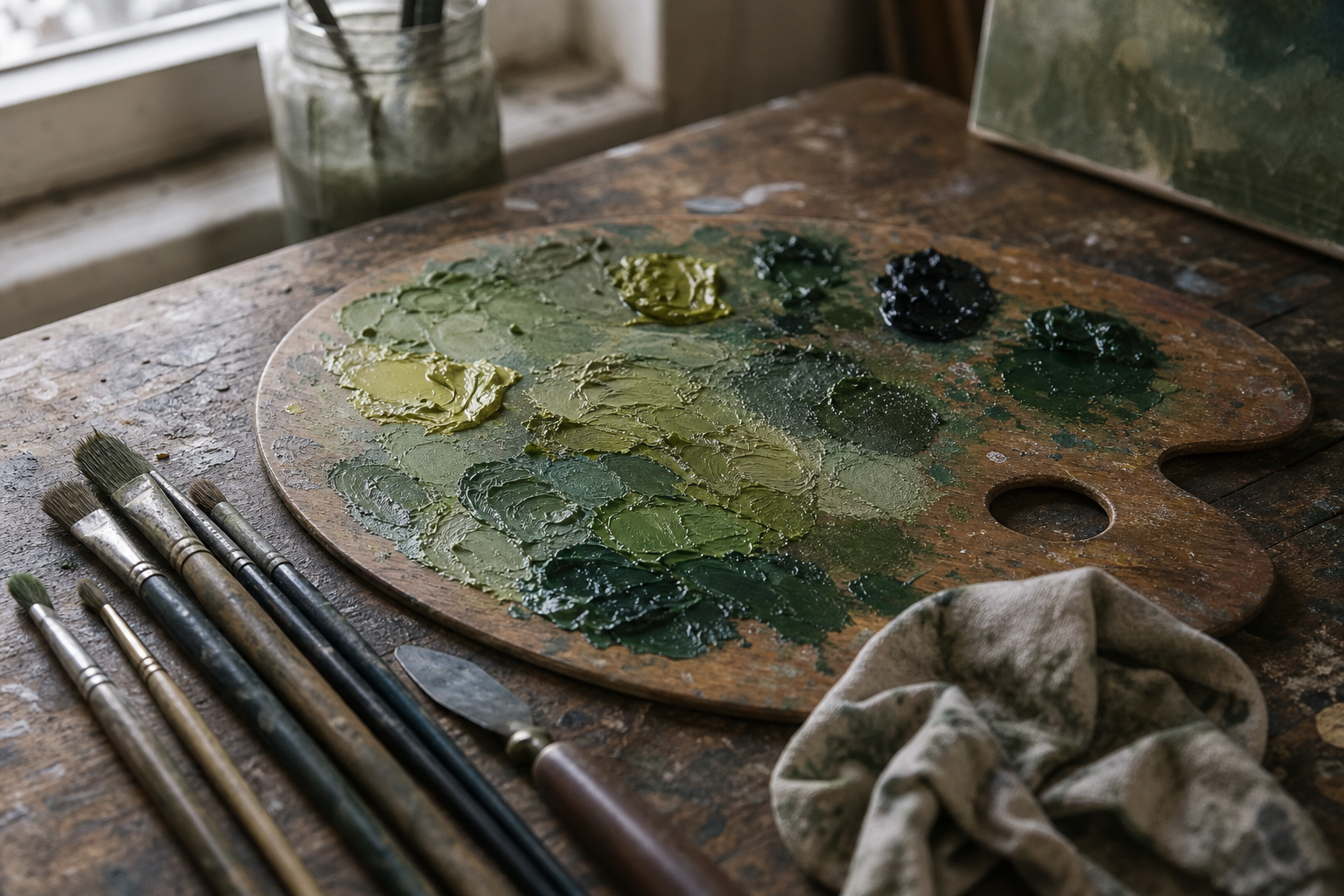
- • Mix greens from blues, yellows and earth colours rather than relying on tube greens.
- • Use yellow ochre plus ultramarine and white as the core grey-green for British landscapes.
- • Start muted and increase intensity only where the scene genuinely shows sunlit or saturated passages.
- • Prep a mother mix and match value first, hue second, to keep greens related across the painting.
- • Mute vivid mixes with burnt sienna or raw umber rather than white and practice colour charts to build intuition.
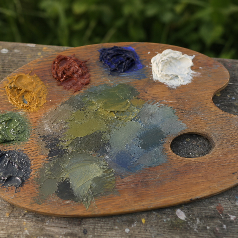
Greens are the colour that trips up more landscape painters than almost any other. We've all been there: phthalo green straight from the tube, and it looks absolutely nothing like the hedgerow in front of us. Too bright, too plastic, too much like a cartoon meadow. If you want to paint greens in plein air that actually look convincing, the solution isn't a new tube of paint. It's a shift in how you approach mixing. Mix your greens from blues, yellows and earth colours, and you'll have far more control over the result than any convenience green can offer. The principles are straightforward, and if you're already mixing colours outdoors, you almost certainly have everything you need.
Why Tube Greens Rarely Work Outdoors
The problem with phthalo, sap green and viridian
Phthalo green, sap green and viridian are all extremely high in chroma. They are more intense, more saturated, than almost any green you'll actually find in nature. Used straight from the tube, they look synthetic against the subtlety of a real landscape. Even mixed generously with titanium white, they tend to retain an artificial quality that sits uncomfortably on the canvas.
Sap green is worth a particular mention: it's often a convenience mixture rather than a single pigment, and the formula varies between manufacturers. What reads as a warm, useful olive green in one brand can be a cool, almost luminous tone in another. That inconsistency makes it difficult to build reliable habits around.
None of this means these colours are useless. A very small amount of phthalo can be a useful booster for specific passages. But they shouldn't be the primary source of your foliage colour.
What British greens actually look like
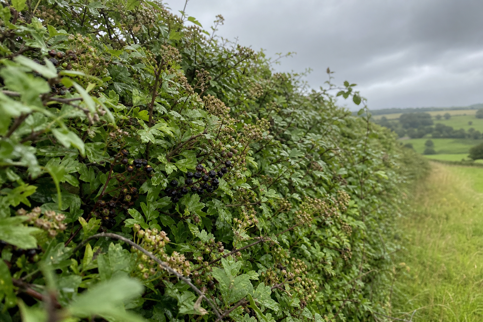
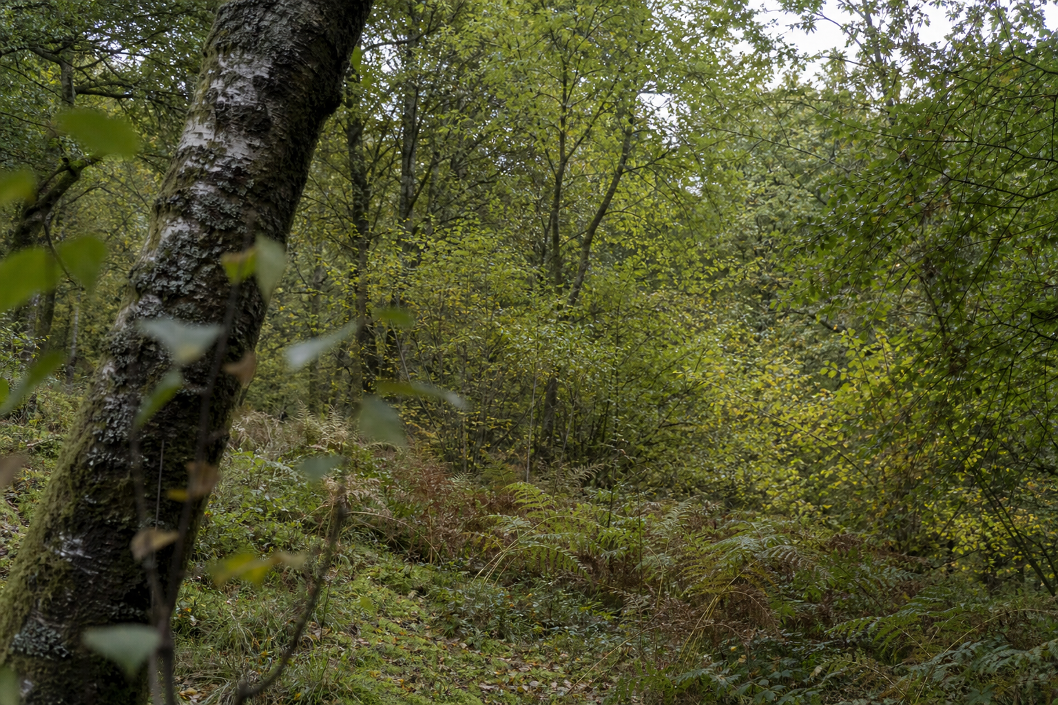
Before you mix anything, it's worth pausing to really look at the greens in front of you. British fields, hedgerows and woodland are characterised by cooler, greyer, more muted tones than the greens you'll see demonstrated in many painting tutorials, which often draw on Mediterranean or North American landscapes.
Under the overcast skies that dominate much of the year in the UK, greens shift noticeably towards grey-green and olive. The value range compresses. Vivid blue-greens and lime greens exist, but they're the exception rather than the rule, and when they do appear, they work best as restrained accents rather than the dominant note.
The implication for mixing is significant: start muted, and push towards intensity only where you genuinely see it.
The Palette You Actually Need for Mixing Greens
Two yellows, two blues, a handful of earths
The good news is that mixing natural greens for landscape painting doesn't require a specialist palette. A compact set of colours you almost certainly already own will cover the full range of British landscape greens.
Here's what to have on your palette:
- Warm yellow: cadmium yellow medium or a permanent yellow medium substitute. Genuine cadmium is expensive; a hansa or permanent yellow is lightfast and works well.
- Cool yellow: lemon yellow, sometimes labelled yellow light. Cleaner and more acidic than cadmium yellow.
- Yellow ochre: arguably the single most useful colour for British landscape greens. Earthy, warm and naturally muted.
- Warm blue: French ultramarine, the warm blue on most landscape palettes. Rich and slightly violet in undertone.
- Cool blue: cerulean or cobalt blue. Both work well; cerulean is lighter and airier, cobalt is slightly stronger. Phthalo blue is an option but it's very powerful and needs careful handling.
- Earth colours: burnt sienna and raw umber. Both are invaluable for muting and warming greens.
- Titanium white: for value adjustment.
- Optional: a single strong green such as phthalo or viridian, kept in reserve as a saturation booster for specific passages only.
| Colour | Role | Notes |
|---|---|---|
| Cadmium / permanent yellow medium | Warm yellow | Bright, sunlit greens and grass |
| Lemon yellow | Cool yellow | Clean, fresh greens; use sparingly |
| Yellow ochre | Earthy yellow | Workhorse for hedgerows and fields |
| French ultramarine | Warm blue | Deep foliage darks; mixes rich olive greens |
| Cerulean or cobalt blue | Cool blue | Lighter, cooler greens; sky-influenced passages |
| Burnt sienna | Warm earth | Warms and mutes greens; shadow passages |
| Raw umber | Neutral earth | Quieter, greyer mixes; excellent for distance |
| Titanium white | Lightener | Adjust value; use with care to avoid chalky results |
| Optional: phthalo green | Saturation booster | Small amounts only; not a main foliage colour |
Do you need to buy anything new?
Almost certainly not. If you have a basic landscape palette, the colours above are likely already sitting on it. The skill here is in how you combine what you have, not in accumulating more tubes. A light kit is also a genuine advantage outdoors in Britain: you don't want to be hauling a heavy box across a wet field when the weather turns.
How to Mix Greens That Look Like the British Countryside
Start muted, then push intensity
Mix your greens slightly duller than you think you need. It is far easier to add a touch more yellow or blue to push a muted mix towards brightness than it is to knock back a vivid mix. British landscapes reward restraint.
Grey-green for hedgerows and fields
Mix: Yellow ochre + French ultramarine + titanium white
This is the most useful single mix for painting the British countryside. Yellow ochre and ultramarine produce a naturally muted, grey-green that sits comfortably in almost any overcast landscape scene. Adjust the ratio to suit: more ultramarine for darker, cooler passages; more ochre for warmer, sunlit sections. A small addition of burnt sienna will warm and slightly dull the mix further, which works well for shadowed hedgerow passages.
Learn this mix well. It will serve you across a huge range of British landscape conditions, from damp autumn fields to overcast summer hedgerows.
Sunlit grass and fresh foliage
Mix: Cadmium yellow (or permanent yellow) + cerulean or cobalt blue
This mix is brighter and more saturated than the hedgerow combination, so use it selectively for passages that are genuinely catching direct light. A small addition of yellow ochre or a touch of burnt sienna will stop it from tipping into synthetic territory.
The key is restraint: reserve this for focal areas, not the whole foreground. A sunlit passage reads as luminous precisely because it sits against quieter, more muted greens. If you use it everywhere, the effect disappears.
Olive and woodland greens
Mix: French ultramarine + lemon yellow, adjusted with raw umber or a touch of burnt sienna
Raw umber is the key ingredient here. It quietens the green without making it chalky, and pushes it towards the deep, slightly dusty olive tones typical of British deciduous woodland in summer. For a richer, warmer woodland dark, try cadmium yellow with ultramarine and a small amount of burnt sienna instead. Both combinations are worth exploring on a colour chart before heading outside.
Distant trees and atmospheric greens
Mix: Ultramarine + yellow ochre + titanium white, with a touch of raw umber or a hint of warm red
Atmospheric perspective means that distant greens should be cooler, lighter and less saturated than greens in the foreground. Adding a small amount of a complementary colour, a warm red or transparent red oxide, is one of the most reliable ways to push a green towards that hazy, receding quality. Keep the mix noticeably lighter and greyer than anything in the mid-ground, and you'll find distant trees begin to sit back convincingly in the picture.
Green mixing at a glance
- Hedgerow / field
- Yellow ochre + ultramarine + white
- Sunlit grass
- Cadmium yellow + cerulean
- Woodland / olive
- Ultramarine + lemon yellow + raw umber
- Distant trees
- Ultramarine + ochre + white + touch of red
Muted, grey-green; the British workhorse
Brighter; use selectively on lit passages
Deep, quiet; typical of UK deciduous woodland
Cooler and greyer; atmospheric perspective
How to Mute a Green That Has Gone Too Vivid
It happens to everyone: you mix a green that looks plausible on the palette and then it hits the canvas looking far too bright. Here's how to bring it back.
The instinctive response is to add white, but white is the wrong tool for muting. It lightens value as well as reducing chroma, which can introduce value errors into your painting. It also tends to make greens look flat and chalky rather than naturally subdued.
Burnt sienna is the first thing to reach for. A small amount warms and dulls a green without destroying it. Transparent red oxide or a touch of cadmium red works similarly and is excellent for pushing greens towards the earthy, grounded quality of British hedgerow and field.
Raw umber is useful when you want to quieten a green without shifting its temperature dramatically. It's a subtler muting agent than sienna, and particularly good for distant passages where you need the green to recede without looking warm.
If the vivid green came from a bright yellow in the original mix, sometimes the simplest solution is to start again, replacing the lemon yellow or cadmium with yellow ochre. It's often quicker than trying to rescue a mix that has gone too far.
Muting with white vs. muting with earth colours
Pros
- + Earth colours preserve the life and warmth of the mix
- + Adding burnt sienna or raw umber matches how light behaves in nature
- + Complements add subtle colour interest across the painting
Cons
- - White quickly makes greens flat and chalky
- - White lightens value as well as reducing chroma, which can cause value errors
Working With Greens on Location
The mother mix approach
One of the most practical habits you can develop for plein air greens is the mother mix. Before you start painting, mix a single neutral, mid-value grey-green that represents the overall tone of the scene in front of you. This becomes your palette anchor: a reference point from which you pull small amounts and adjust for each individual passage.
From that mother mix, you push warmer and slightly more saturated towards the foreground. Cooler and greyer towards the distance. Darker for shadow areas; lighter where the sky is reflecting into the foliage. The mother mix keeps your greens related to one another, which is what builds colour harmony across a painting. It also removes a great deal of decision fatigue when the light is moving and you're under pressure to work quickly.
Value first, colour second
This principle is worth understanding clearly, because it's one of the most common and most fixable mistakes in plein air painting. Squint at the scene in front of you: narrow your eyes until the detail disappears and you're seeing the landscape as masses of light and dark. Now mix each green to match its correct value before worrying about whether the hue is exactly right.
A green that is the correct value but slightly off in hue will read well in context. A green that is the right hue but wrong in value will look wrong no matter how accurate the colour appears in isolation. Value carries the structure; hue is the detail on top.
Handling UK conditions
Under the overcast skies that characterise much of British painting weather, the value range across the landscape compresses. The difference between the lightest and darkest greens is narrower than it would be in strong Mediterranean sunlight. Use this to your advantage: rather than searching for dramatic value contrasts, focus on subtle shifts in temperature and hue between passages. A warmer green here, a slightly cooler one there, is often enough to create a convincing sense of depth.
When sunlight does break through, notice how the lit passages become warmer and very slightly more saturated. This is the moment to introduce a touch more yellow into your mix. Keep your palette shaded if possible: direct sunlight on the palette makes mixed colours appear darker than they really are, which can lead you to mix lighter and lighter without realising it.
Pre-mix before you start
Spend five minutes at the start of each session mixing a small set of greens: one light, one mid-tone, one dark; one warm, one cool. You can modify these as you go, but having them ready removes pressure when the light is changing fast.
Building Your Eye for Green
The mixing strategies above are starting points, not fixed answers. What makes them work is observation, and that's a skill that builds over time through deliberate practice.
The most valuable thing you can do is spend a few minutes really looking at the greens in front of you before you mix anything. Notice how the same hedgerow contains dozens of slightly different tones: warm where the light catches it, cool in the shadow, greyer where it fades into the distance. The green of a sunlit field is a different animal from the green of woodland in the same scene, even if both look simply "green" at first glance.
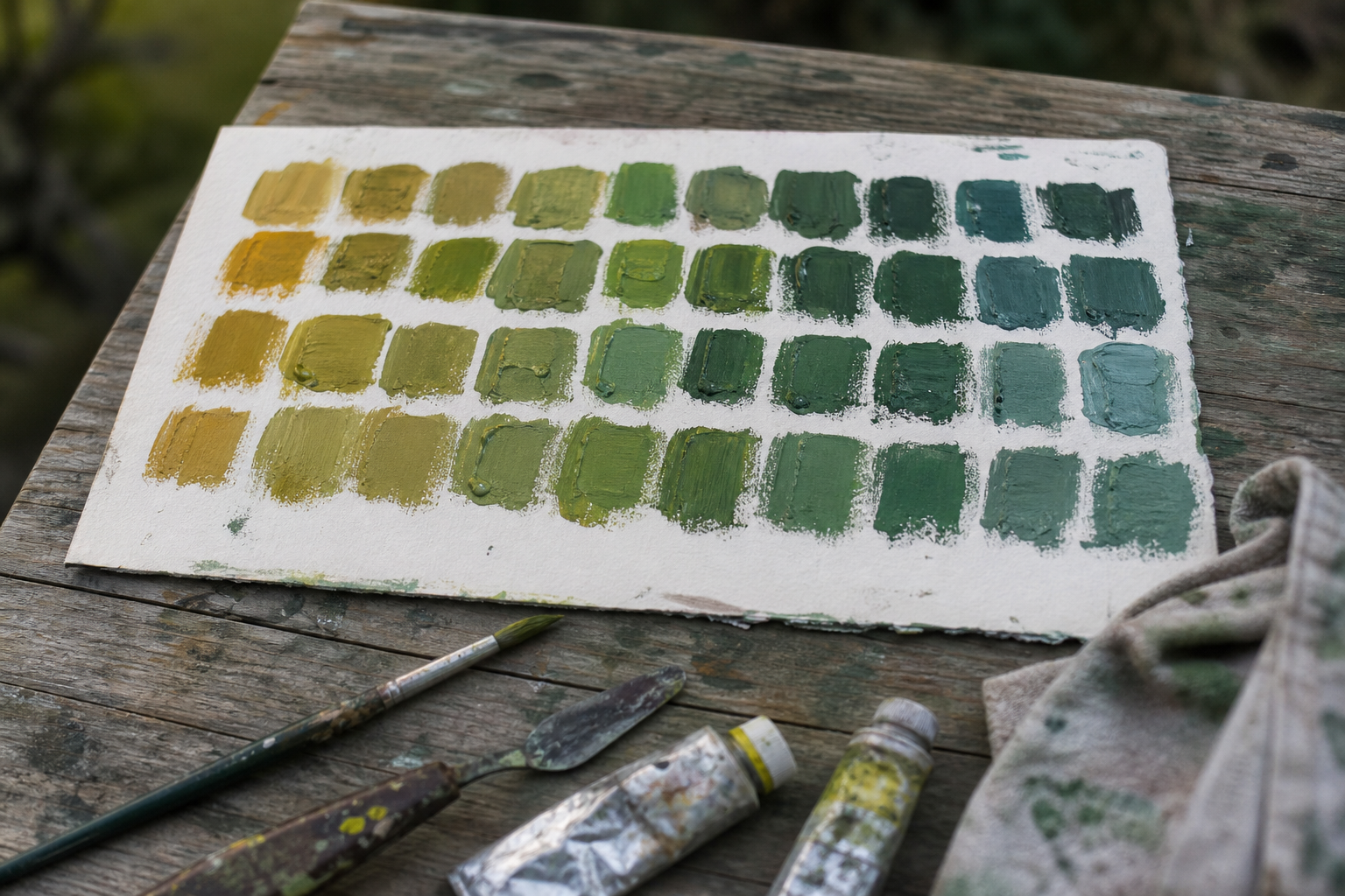
At home, make colour charts. Mix each of your blues with each of your yellows, then add earths in varying amounts and see what you get. Note which combinations feel most like the British landscape greens you're trying to paint. This kind of systematic exploration, done quietly in the studio, pays dividends when you're outside and time is short.
Consider dedicating occasional plein air sessions specifically to green subjects: a woodland edge, a field under overcast light, a stretch of hedgerow in autumn. Use these sessions not to produce finished paintings but to practise observation and mixing. The pressure is off, the focus is narrow, and you'll learn faster for it.
Accept that your greens will be wrong sometimes. That's not failure; it's how you find out which mixes work for the subjects and conditions you encounter most often. The painters who mix convincing plein air greens aren't following a recipe. They're applying habits of observation built up over many sessions outdoors, with a palette they know well, in the landscapes they've come to understand. That's entirely within reach, and it starts with getting outside and looking.
FAQ
Frequently Asked Questions
What basic palette do I need to mix natural greens plein air?
Two yellows (warm and cool), two blues (warm and cool), yellow ochre, burnt sienna, raw umber, titanium white and an optional strong green like phthalo for boosting saturation.
How do I mute a green that is too vivid?
Avoid white. Use burnt sienna or transparent red oxide to warm and dull, or raw umber to quiet without shifting temperature. If the yellow is the problem, switch to yellow ochre and remix.
What is a mother mix and why use one?
A mother mix is a neutral mid-value grey-green you prepare at the start. It becomes your anchor so all greens relate to each other and you can push warmer, cooler, lighter or darker from the same base.
How should distant trees and atmospheric greens be mixed?
Make them cooler, lighter and less saturated. Start with ultramarine plus yellow ochre and white, then add a touch of raw umber or a warm red to push the mix into a hazy, receding quality.
Do I need phthalo or tube greens for plein air work?
No. Tube greens are useful as small boosters but are rarely the primary source of believable foliage colour. Mix from blues, yellows and earths for more natural results.
Author

PleinAirPainting Editorial Team
PleinAirPainting.co.uk helps artists paint outdoors with confidence through UK-focused guides, equipment advice, resources and plein air inspiration.