How to Photograph Your Paintings for Social Media (and Online Sales)
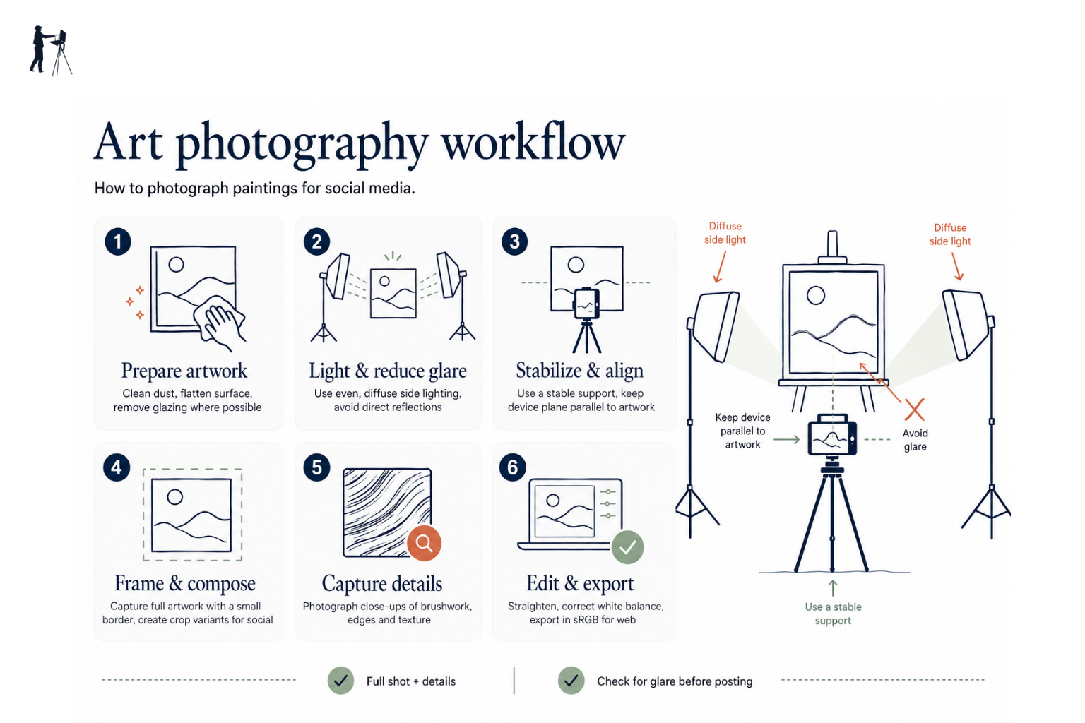
Practical tips for how to photograph paintings: use diffused light, keep the camera level, correct white balance, and add raking light or close ups to show texture.
Key takeaways
- • Use diffused natural light where possible; north facing windows on grey days are ideal.
- • When artificial light is needed use two identical 5000K to 5500K bulbs at 45 degree angles.
- • Keep the camera level and parallel to the painting; use a tripod and grid to avoid perspective distortion.
- • Edit for accuracy: straighten, crop, set white balance first, then adjust exposure and contrast sparingly.
- • For plein air pieces make a colour accurate shot and a raking light shot to show texture and brushwork.
You've come home from a session outdoors with a painting you're genuinely pleased with. You prop it up, take a photo on your phone, and the result is somehow both flat and slightly orange, with a glare spot across the top left corner. The actual painting looks nothing like this. If that sounds familiar, you're not alone, and the good news is that knowing how to photograph paintings well is a learnable skill, not a natural talent. Better still, if you're painting in the UK, you already have access to one of the best light sources available: the overcast British sky.
Why Your Painting Photos Probably Look Flat
Before getting into solutions, it helps to know what's going wrong. Most disappointing painting photos come down to three problems.
The first is glare. Varnished oils, wet paint, and heavily textured surfaces all reflect light sources back into the lens. Even a painting with no surface sheen can pick up a hot spot if the light is coming from the wrong angle.
The second is colour casts. Standard indoor bulbs, whether old incandescent or warm-toned LEDs, push the image towards orange or yellow. This can be hard to fix in editing, especially in shadow areas.
The third is camera tilt. Even a degree or two of tilt causes the painting to appear trapezoidal in the photo: one side taller than the other, the top narrower than the bottom. This is perspective distortion, not a flaw in the painting, but it looks unprofessional and can put buyers off.
All three problems are straightforward to fix with the right setup.
The Best Lighting for Photographing Paintings
Natural light: your first choice
Diffused natural light is the gold standard for photographing artwork, and this is where UK painters have a genuine advantage. A uniformly cloudy sky acts like a giant softbox, producing soft, even light with no harsh shadows and no direct reflections. On a grey British afternoon, positioned near a window, you're working with conditions that photographers pay considerable money to replicate artificially.
North-facing windows are ideal because they never receive direct sunlight, which means the light is consistent throughout the day. Position your painting so the window light falls across it from the front or at a slight angle. Avoid placing the painting directly in front of the window with the camera pointing towards it; that will silhouette the painting or cause the camera to underexpose.
If the light is coming in strongly from one side, a large piece of white card on the opposite side can act as a simple reflector to fill the shadows.
Working with artificial light
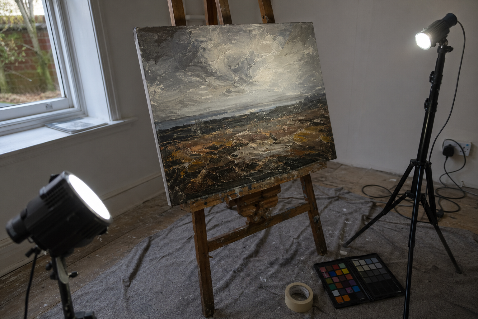
In winter, or in rooms with small windows, natural light often isn't enough. The most reliable artificial setup uses two identical light sources, positioned at 45 degrees to each painting from either side, at roughly the same height as the centre of the work. This even arrangement eliminates shadows and prevents glare from either side.
The key is colour temperature. You want bulbs rated at 5000K to 5500K, described on the packaging as "daylight." These are widely available from B&Q, Screwfix, and most UK hardware shops for a few pounds each. Avoid mixing light sources: a daylight bulb on one side and a warm lamp on the other will cause an uneven colour cast across the painting that is very difficult to correct in editing.
Overcast days are ideal
A uniformly cloudy sky acts like a giant softbox, diffusing light evenly with no harsh shadows or reflections. If you're photographing near a window on a grey British afternoon, you're working with near-perfect conditions.
Setting Up Your Shot
Background and surface
The background behind your painting should be plain and neutral. A light to mid-grey is ideal: it's neutral enough not to influence colour perception, and it avoids the exposure problems that a pure white background can create (cameras tend to underexpose the painting when the surrounding area is very bright). A grey-painted wall, a length of grey card from an art shop, or even a clean grey duvet cover all work well.
Remove everything from the frame that isn't the painting: no easel legs, no brushes propped against the wall, no cups of solvent. Clutter pulls the eye and looks careless, particularly if you're using the photo to sell.
Camera position and alignment
The camera needs to be level with the centre of the painting, not the floor, and parallel to the painting's surface. This is the single most important technical point. If the camera is even slightly below centre and angled upward, the top of the painting will appear narrower than the bottom.
Most smartphone camera apps include a built-in level; look for a grid or level option in your camera settings. A spirit level app works just as well if yours doesn't have one. If you're using a tripod, set the head to level before positioning the camera.
Step back far enough that the painting fills most of the frame without being cropped. Aim to leave a small, even border all the way around, roughly five to ten percent of the frame width. You'll trim this in editing, but having it there means you won't accidentally lose an edge.
Filling the frame
Resist the urge to photograph from too far away. The more of the frame your painting occupies, the more detail and colour information you're capturing. Get close, keep the border even, and crop precisely in post.
Use your phone's grid lines
Turn on the grid overlay in your phone's camera settings. Align the painting's edges with the grid to catch tilt and perspective distortion before you take the shot, not after.
Camera Settings That Actually Matter
Shooting with a smartphone
Turn off portrait mode: it applies artificial blur that you don't want, and the whole painting needs to be sharp. Turn off HDR and absolutely turn off the flash.
Tap directly on the painting in your camera app to set the exposure from the painting's surface, not from the background. On most phones, holding your finger down will lock both focus and exposure, which prevents the camera from readjusting when you take the shot. Shoot at the highest resolution your phone allows.
Modern iPhones and Android phones produce excellent results in good light. You don't need a dedicated camera to get a clean, accurate photograph of your work.
Shooting with a DSLR or mirrorless camera
Use a low ISO, ideally 100 to 200, to keep the image clean. Set an aperture of f/8 to f/11, which ensures the entire flat surface of the painting is sharp. Use a remote shutter release or the self-timer to avoid camera shake when pressing the shutter button.
Set white balance manually to match your light source: daylight if you're using window light, or the colour temperature of your bulbs if you're working artificially. Shooting in RAW gives you the most flexibility for colour correction in editing, though JPEG is perfectly usable in consistent, well-controlled light.
| Setting | Smartphone | DSLR / Mirrorless |
|---|---|---|
| Flash | Off | Off |
| Portrait / bokeh mode | Off | N/A |
| ISO | Auto (in good light) | 100–200 |
| Aperture | N/A | f/8–f/11 |
| White balance | Daylight or cloudy | Match your light source |
| Resolution | Maximum | RAW if possible |
Basic Editing to Get the Colours Right
What to fix and what to leave alone
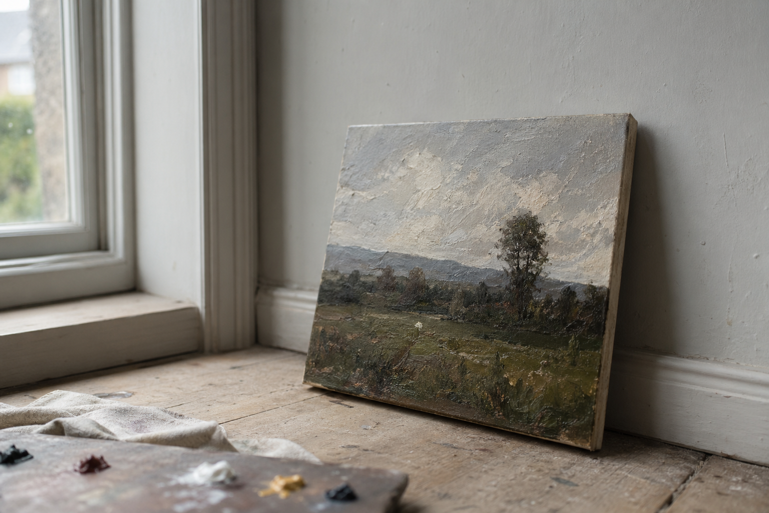
The goal of editing a painting photograph is accuracy, not drama. You're not trying to make the image look more striking than the actual work; you're trying to make it look like the actual work.
Start with straightening and cropping. Get the edges parallel and trim the border. Then correct white balance before touching exposure: if the colour temperature is wrong, any exposure adjustments you make will be working against a false baseline. Once the colour temperature is close, adjust brightness and, if needed, contrast very gently. Avoid the temptation to push saturation; this is one of the most common mistakes and it immediately looks wrong compared to the real painting.
Free and low-cost tools
Lightroom Mobile (free tier), Snapseed (free), and Apple Photos are all capable of handling this workflow on a phone. Lightroom's colour picker tool is particularly useful for paintings: you can click on a neutral area, such as a grey in the background, and the app will correct the white balance automatically.
Checking against the original
When you think you've finished, hold your phone next to the actual painting in the same light and compare them. Colour accuracy matters more than a punchy-looking image, especially if you're selling. If the blues are wrong or the lights are too warm, go back and adjust.
The grey card trick
If you shoot with a small piece of mid-grey card in the first frame, you can use it to set a custom white balance in editing. Remove that frame before posting. It takes ten seconds and saves a lot of colour-correction time.
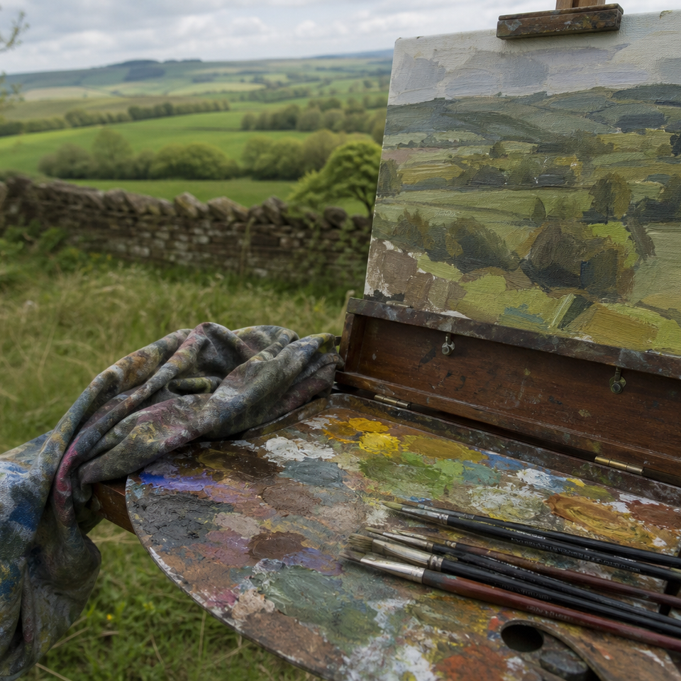
Photographing Plein Air Work Specifically
Plein air paintings are often different from studio work in one important respect: texture. Impasto marks, palette knife passages, and the visible energy of brushwork made quickly outdoors are part of what makes plein air painting compelling. A flat, evenly lit photograph captures colour accurately but can lose this character entirely.
It’s worth thinking about two distinct types of photograph for each piece. A documentary shot, taken with even front light, gives accurate colour and clean edges. This is what you want for a listing image if you’re selling, or anywhere colour fidelity matters most. A character shot, taken with raking light, uses a single light source positioned to one side at a low angle to throw the texture into relief. The result shows the physical quality of the paint surface in a way that even lighting never quite achieves.
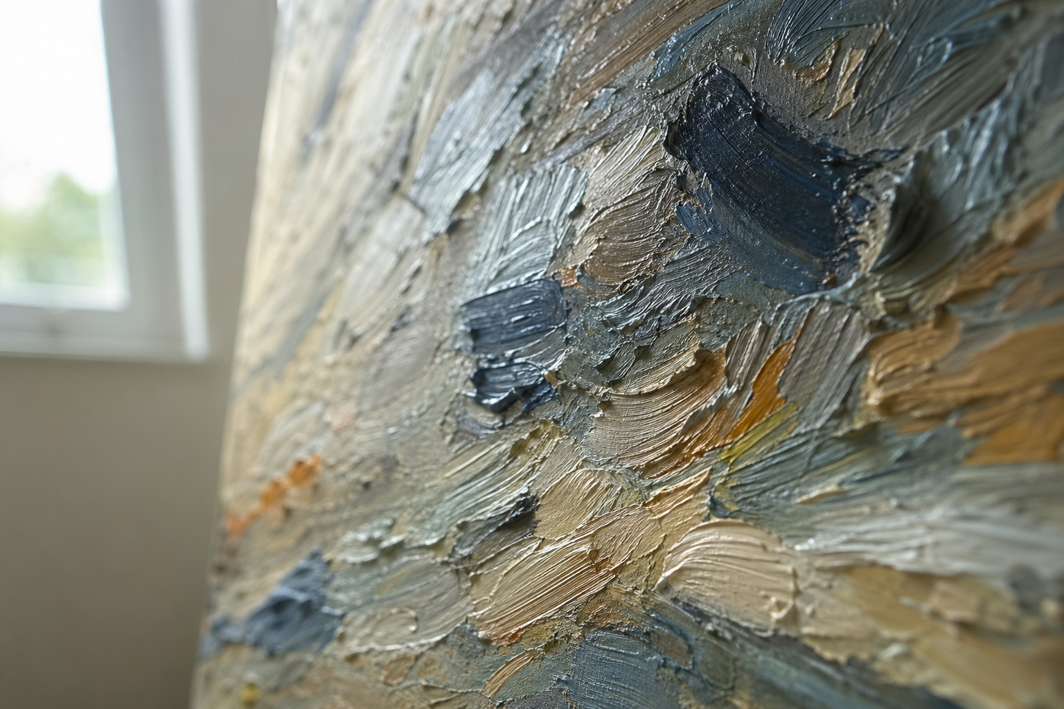
For raking light shots, simply move one of your light sources to the side and slightly forward of the painting's plane, switch off or block the other light source, and observe how the texture emerges. Close-up detail shots taken this way make excellent carousel images and show viewers what the surface actually looks and feels like.
One practical note on wet oil paintings: the surface will be reflective regardless of your lighting arrangement. If you can wait until the paint has dried to a matte stage before photographing, do so. If you need a photograph sooner, tilting the painting very slightly away from the camera (just two or three degrees at the top) can reduce reflections without introducing noticeable distortion.
If you want a contextual photograph of the work in the field, soft overcast light is again ideal. Avoid direct sun falling on the canvas: it creates glare, shifts colour temperature, and often produces a harsh shadow from the frame edge across the surface.
Presenting Your Work on Social Media
Instagram's dominant format is the 4:5 portrait ratio, which occupies more screen space in a feed than a square or landscape image. Landscape-format paintings present a challenge here: you can either post them square with a small loss of resolution, or add a thin neutral border above and below to bring the image to portrait ratio. A white or light grey border looks clean and has the secondary effect of making the painting feel properly presented rather than cropped.
For carousels, use the second or third slide for a close-up detail shot: a section of interesting brushwork, a passage of sky, or a particularly lively area of paint. These reward viewers who swipe through and give a sense of the physical quality of the work that the overall composition shot doesn't always convey.
Pairing the finished painting with a photograph of the location, or the view that inspired it, performs consistently well. A simple side-by-side or a two-slide carousel showing place and painting together gives viewers context and tells a small story.
Shoot at the highest resolution available to you even if the platform will compress it on upload. Starting with more information means the compressed result will be better than a low-resolution original would be.
Avoid placing a large watermark across the centre of the main image. A small, discreet mark at the edge is reasonable; anything more prominent tends to put buyers off and can make the work look less confident.
Once you've run through this process a few times, it becomes quick: ten minutes from picking up the camera to a final edited image ready to post. The first attempt takes longest, mainly because you're making decisions about your setup. After that, if you keep the same lighting arrangement and background in place, subsequent photographs become faster still. Treat it as the final step of finishing a painting rather than a separate chore, and you'll find the results are consistently closer to what the work actually looks like in front of you.
FAQ
Frequently Asked Questions
How do I avoid glare and reflections on varnished or wet paintings?
Use diffused light from an overcast sky or two identical daylight lamps. Position lights at an angle, slightly tilt the painting away from the camera by a few degrees, or use a polarising filter to reduce reflections.
Why do my photos look orange and how do I fix colour casts?
Mixed or warm indoor bulbs create orange casts. Use 5000K to 5500K daylight bulbs, set white balance to match your light, or include a mid grey card and correct colour in editing. Shooting RAW gives more flexibility.
How can I stop the painting from looking skewed or trapezoidal?
Keep the camera level with the centre of the painting and parallel to the surface. Use a tripod and the camera grid or a spirit level to check alignment before shooting.
What lighting works best for photographing paintings?
Diffused natural light is best, especially on an overcast day or from a north-facing window. When using artificial light, use two identical daylight bulbs at 45 degree angles to the painting for even illumination.
How do I capture texture and brushwork as well as colour?
Make two images: a documentary shot with even front light for accurate colour, and a character shot with raking light or a single side light to reveal impasto and texture. Include close ups for detail.
Author

PleinAirPainting Editorial Team
PleinAirPainting.co.uk helps artists paint outdoors with confidence through UK-focused guides, equipment advice, resources and plein air inspiration.